fl_char 雷达图-鸿蒙PC用Electron框架实现详解
欢迎加入开源鸿蒙PC社区:
https://harmonypc.csdn.net/
atomgit仓库地址: https://atomgit.com/m0_66062719/fl_char_tableshow
1. 概述
1.1 雷达图的概念与特点
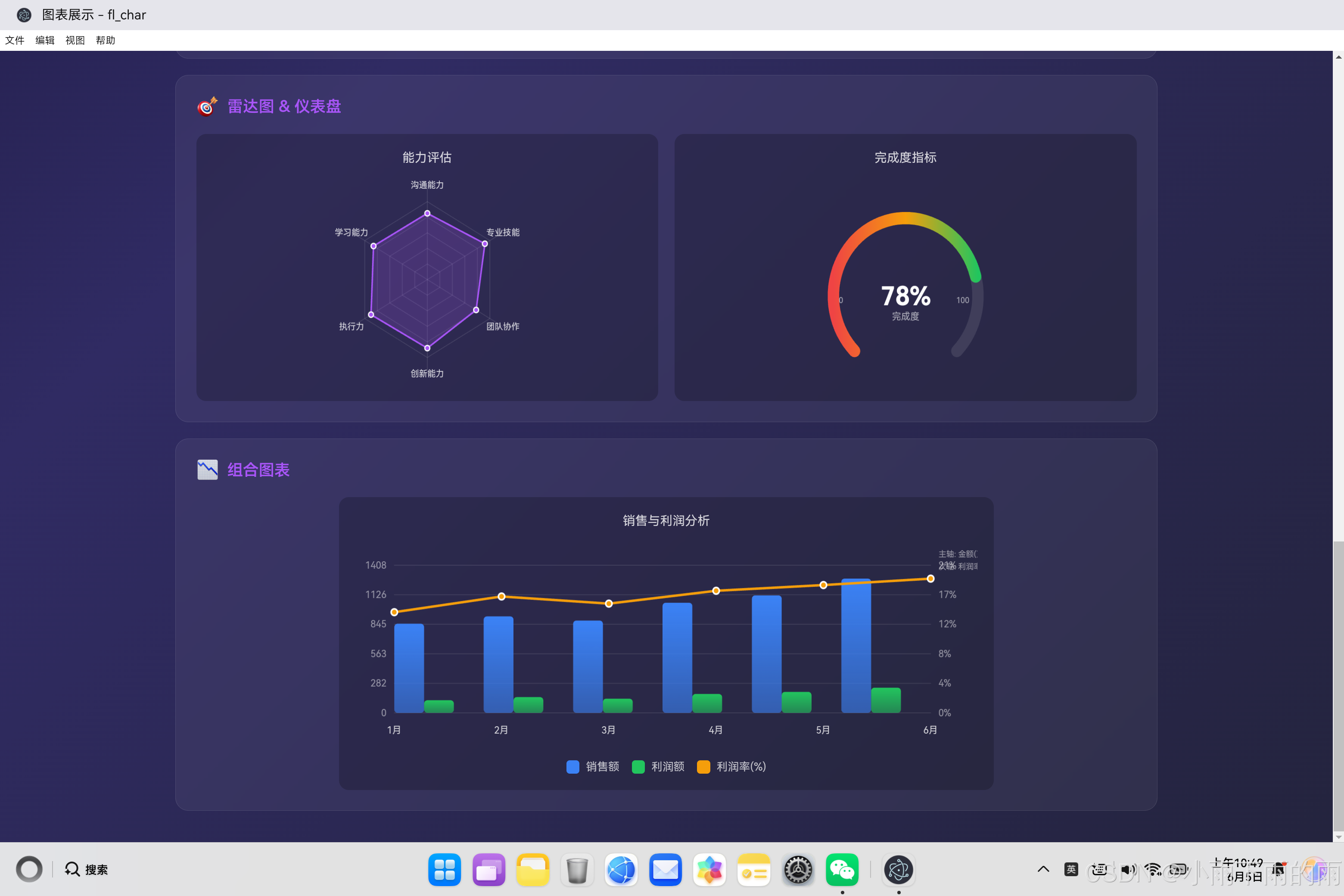
雷达图是一种独特而强大的多维度数据可视化工具,它能够在二维平面上展示三个或更多维度的数据对比。不同于传统的折线图或柱状图,雷达图以一个中心点为原点,每个数据维度对应一条从中心向外辐射的轴线,所有轴线呈放射状分布,角度均匀分隔。这种独特的可视化形式让它特别适合展示对象在多个属性上的综合表现。
雷达图的核心价值在于其呈现"整体轮廓"的能力。当我们把一个对象的所有维度数据连接起来,会在雷达图上形成一个不规则的多边形。这个多边形的形状、面积、对称性等特征,能够直观地传达数据对象的综合实力分布。比如在员工能力评估中,一个"均衡型"员工的雷达图可能呈现出一个近似圆形的轮廓,而一个"偏科型"员工的雷达图则可能呈现出某一方向特别突出、其他方向平平的形态。
从视觉设计的角度来看,雷达图具有独特的美学价值。它具有对称之美,数据点在极坐标上均匀分布,形成一种数学般的和谐感。同时,它也具有信息密度高的特点,能够在单一图表中承载多个维度的对比信息。这种图表类型在游戏设计中被广泛使用来展示角色属性,在企业管理中被用于多维度绩效考核,在体育领域被用于运动员综合能力分析。
1.2 雷达图与其他图表的对比
雷达图与其他常见图表类型有着本质的区别,每种图表都有其最佳应用场景。
折线图适合展示数据随时间变化的趋势,强调的是"线"的概念——数据的流动性和连续性。雷达图则适合展示多维度静态对比,强调的是"面"的概念——数据在各个维度上的分布情况。折线图的X轴通常是时间或有序类别,而雷达图的轴没有顺序概念,各个维度地位平等。
柱状图适合展示分类数据之间的直接对比,通过柱子的高度差异来呈现大小关系,信息传达直观但维度有限。雷达图则能够同时展示更多维度的数据,但精确的数值比较相对困难。在需要精确比较单一维度数值时,柱状图更胜一筹;在需要把握整体轮廓和相对平衡性时,雷达图更有优势。
饼图和环形图适合展示部分与整体的比例关系,强调的是构成比例。雷达图则强调各维度与中心点的距离关系,反映的是各维度上的绝对表现或相对于最大值的完成度。两者的数据视角完全不同,饼图问的是"各部分占多少比例",雷达图问的是"各维度表现如何"。
1.3 雷达图的应用场景
雷达图在实际应用中有着广泛的用武之地,以下是几个典型的应用场景。
在人力资源领域,雷达图常用于员工能力评估和人才盘点。企业可以从多个维度评估员工,如沟通能力、专业技能、团队协作、创新能力、执行力、学习能力等。将这些维度的评分绘制成雷达图,管理者能够一目了然地看出员工的优势和短板,为人才培养和岗位匹配提供数据支持。在团队盘点中,多个员工的雷达图叠加在一起,还能进行横向对比,发现团队的能力分布特点。
在产品分析和竞品对比中,雷达图能够展示产品在多个特性上的表现。比如智能手机可以比较屏幕、拍照、续航、性能、设计、价格等维度;或者某款产品在多个评测指标上的表现。通过雷达图的对称性分析,可以直观判断产品是否存在明显短板,或者是否在某些方面特别突出。
在体育运动分析中,雷达图被广泛用于运动员能力画像。足球运动员可以从速度、力量、耐力、技术、意识、体力等维度评估;篮球运动员可以从得分、助攻、篮板、抢断、盖帽等维度评估。这种多维度能力可视化帮助教练制定战术、进行人员配置,也帮助球迷更好地理解运动员的特点。
在个人发展和自我认知中,雷达图也有独特的应用价值。个人可以从多个维度评估自己的技能栈,发现自己的核心竞争力和需要提升的方向。在目标设定和进度追踪中,可以用雷达图来可视化当前状态与目标状态之间的差距。
2. 架构设计
2.1 组件架构概览
雷达图组件的架构设计需要考虑极坐标系的特殊性。与直角坐标系图表不同,雷达图的所有计算都是基于角度和距离的,这要求组件在设计时充分考虑这种坐标系统的特点。
class RadarChart {
    constructor(canvasId, data, options = {}) {
        // 核心属性
        this.canvas = null;
        this.ctx = null;
        this.data = null;
        this.options = {};

        // 尺寸相关
        this.width = 0;
        this.height = 0;
        this.dpr = 1;

        // 雷达图特定参数
        this.centerX = 0;
        this.centerY = 0;
        this.radius = 0;
        this.levels = 5;
        this.labels = [];
        this.angleStep = 0;
        this.startAngle = -Math.PI / 2;  // 从12点钟方向开始

        // 状态管理
        this.hoveredPoint = null;
        this.selectedPoint = null;

        // 初始化
        this.init(canvasId, data, options);
    }

    init(canvasId, data, options) {
        // 获取Canvas元素
        this.canvas = document.getElementById(canvasId);
        if (!this.canvas) {
            throw new Error(`Canvas element with id "${canvasId}" not found`);
        }

        // 获取绑制上下文
        this.ctx = this.canvas.getContext('2d');

        // 合并配置
        this.options = { ...this.getDefaultOptions(), ...options };

        // 设置数据
        this.setData(data);

        // 初始化尺寸
        this.resize();

        // 绑定事件
        this.bindEvents();

        // 渲染
        this.render();
    }

    getDefaultOptions() {
        return {
            levels: 5,
            maxValue: 100,
            startAngle: -Math.PI / 2,
            clockwise: true,
            gridType: 'polygon',  // 'polygon' 或 'circle'
            gridLevels: 5,
            labelOffset: 25,
            pointRadius: 4,
            lineWidth: 2,
            fillOpacity: 0.2,
            showPoints: true,
            showLabels: true,
            showGrid: true,
            animate: true,
            animationDuration: 800,
            hoverEffect: true,
            onPointClick: null,
            onPointHover: null
        };
    }
}
2.2 模块划分
雷达图组件的功能可以分为以下几个核心模块:
坐标系管理模块:负责建立极坐标系并管理中心点、半径、角度等基本参数。这个模块是雷达图的基础,所有后续的绘制都依赖于正确的坐标系设置。
网格绘制模块:负责绘制雷达图的背景网格,包括同心多边形网格和从中心向外辐射的轴线。网格是雷达图的参照系,帮助用户定位数据点。
数据映射模块:负责将原始数据值转换为雷达图上的坐标位置。这个模块需要处理数据归一化和极坐标到直角坐标的转换。
区域绘制模块:负责绘制数据区域,包括边框线和填充区域。多数据集的情况下,这个模块需要处理区域的叠加和透明度问题。
标签管理模块:负责在每个轴线的末端绘制维度标签,标签的位置需要根据角度计算以避免与图表内容重叠。
交互处理模块:负责处理鼠标悬停和点击事件,包括数据点的高亮、提示框显示等交互功能。
3. 核心代码实现
3.1 布局计算算法
雷达图的布局计算是整个组件的基础,它确定了网格的大小、角度间隔以及各个数据点的位置。
class RadarChart {
    // 计算布局参数
    calculateLayout() {
        // 获取逻辑尺寸
        this.width = this.canvas.width / this.dpr;
        this.height = this.canvas.height / this.dpr;

        // 计算中心点
        this.centerX = this.width / 2;
        this.centerY = this.height / 2;

        // 计算半径
        // 取宽度和高度的较小值,除以2后减去边距和标签空间
        const maxRadius = Math.min(this.width, this.height) / 2 - 50;
        this.radius = maxRadius;

        // 获取标签
        this.labels = this.data.labels;

        // 计算角度间隔
        // 所有维度均匀分布在圆周上
        this.angleStep = (Math.PI * 2) / this.labels.length;

        // 保存网格参数
        this.gridConfig = {
            levels: this.options.gridLevels,
            maxValue: this.options.maxValue
        };
    }

    // 根据索引计算轴线端点坐标
    getAxisEndpoint(index) {
        // 计算该轴线的角度
        const angle = this.startAngle + index * this.angleStep;

        // 计算超出半径的距离(标签区域)
        const labelDistance = this.radius + this.options.labelOffset;

        // 计算坐标
        const x = this.centerX + Math.cos(angle) * labelDistance;
        const y = this.centerY + Math.sin(angle) * labelDistance;

        return { x, y, angle };
    }

    // 将数据值转换为半径
    valueToRadius(value) {
        // 归一化到0-1范围
        const normalized = Math.min(value / this.options.maxValue, 1);

        // 映射到半径范围
        return normalized * this.radius;
    }

    // 将极坐标转换为直角坐标
    polarToCartesian(angle, radius) {
        return {
            x: this.centerX + Math.cos(angle) * radius,
            y: this.centerY + Math.sin(angle) * radius
        };
    }
}
布局计算的设计考虑了几个关键细节。首先是半径的计算,使用Math.min(width, height) / 2确保雷达图不会超出画布的任一边界。然后减去50像素的空间,为标签文字留出足够的显示区域。
角度间隔的计算使用Math.PI * 2 / labels.length,这确保所有维度能够均匀分布在圆周上,无论有多少个维度。起始角度设置为-Math.PI / 2(负90度,即12点钟方向),这是雷达图的标准起始位置。
3.2 网格绘制技术
雷达图的网格由两个部分组成:同心多边形(层级)和从中心向外辐射的轴线。
class RadarChart {
    // 绘制完整的网格
    drawGrid() {
        if (!this.options.showGrid) return;

        const ctx = this.ctx;

        // 设置网格样式
        ctx.strokeStyle = 'rgba(255, 255, 255, 0.1)';
        ctx.lineWidth = 1;

        // 绘制同心多边形网格
        this.drawPolygonGrid();

        // 绘制轴线
        this.drawAxes();
    }

    // 绘制同心多边形网格
    drawPolygonGrid() {
        const ctx = this.ctx;
        const { levels, maxValue } = this.gridConfig;

        // 从内到外绘制每一层
        for (let level = 1; level <= levels; level++) {
            // 计算当前层的半径
            const levelRadius = (this.radius / levels) * level;

            // 计算该层对应的数值
            const levelValue = (maxValue / levels) * level;

            // 开始新路径
            ctx.beginPath();

            // 绘制多边形的每一条边
            for (let i = 0; i <= this.labels.length; i++) {
                const index = i % this.labels.length;
                const angle = this.startAngle + index * this.angleStep;

                const x = this.centerX + Math.cos(angle) * levelRadius;
                const y = this.centerY + Math.sin(angle) * levelRadius;

                if (i === 0) {
                    ctx.moveTo(x, y);
                } else {
                    ctx.lineTo(x, y);
                }
            }

            ctx.closePath();
            ctx.stroke();

            // 在最外层绘制数值标签
            if (level === levels) {
                this.drawLevelLabel(levelValue);
            }
        }
    }

    // 绘制轴线(从中心到每个标签的直线)
    drawAxes() {
        const ctx = this.ctx;

        ctx.strokeStyle = 'rgba(255, 255, 255, 0.15)';

        for (let i = 0; i < this.labels.length; i++) {
            const angle = this.startAngle + i * this.angleStep;

            // 轴线的终点在标签位置
            const endX = this.centerX + Math.cos(angle) * (this.radius + 10);
            const endY = this.centerY + Math.sin(angle) * (this.radius + 10);

            ctx.beginPath();
            ctx.moveTo(this.centerX, this.centerY);
            ctx.lineTo(endX, endY);
            ctx.stroke();
        }
    }

    // 绘制层级数值标签
    drawLevelLabel(value) {
        const ctx = this.ctx;

        // 在右侧绘制最外层的数值
        ctx.fillStyle = 'rgba(255, 255, 255, 0.4)';
        ctx.font = '10px sans-serif';
        ctx.textAlign = 'left';
        ctx.textBaseline = 'middle';

        // 选择最右边那条轴线的位置来显示标签
        const angle = this.startAngle + this.labels.length - 1;
        const labelRadius = this.radius + 15;
        const x = this.centerX + Math.cos(angle) * labelRadius;
        const y = this.centerY + Math.sin(angle) * labelRadius;

        ctx.fillText(value.toString(), x + 5, y);
    }
}
网格绘制采用了分层绘制的策略。最外层的同心多边形对应数据最大值,每个内层多边形按照等比例递减。这种设计让用户能够通过比较多边形的大小来判断数据的整体水平。
轴线的绘制采用了从中心向外辐射的方式。每一根轴线都对应一个数据维度,轴线的角度决定了该维度的方向。轴线的颜色比同心多边形更浅,这样网格的主要视觉层级是同心多边形,数据区域的轮廓会更加突出。
3.3 数据区域绘制
数据区域是雷达图的核心视觉元素,它由边框线和填充区域组成,共同展示数据的轮廓。
class RadarChart {
    // 绘制单个数据集的区域
    drawDataArea(dataset, index = 0) {
        const ctx = this.ctx;

        // 计算所有数据点的坐标
        const points = dataset.data.map((value, i) => {
            const angle = this.startAngle + i * this.angleStep;
            const r = this.valueToRadius(value);
            return this.polarToCartesian(angle, r);
        });

        // 绘制填充区域
        ctx.beginPath();
        points.forEach((point, i) => {
            if (i === 0) {
                ctx.moveTo(point.x, point.y);
            } else {
                ctx.lineTo(point.x, point.y);
            }
        });
        ctx.closePath();

        // 填充
        const fillColor = this.hexToRgba(dataset.color, this.options.fillOpacity);
        ctx.fillStyle = fillColor;
        ctx.fill();

        // 绘制边框线
        ctx.strokeStyle = dataset.color;
        ctx.lineWidth = this.options.lineWidth;
        ctx.lineCap = 'round';
        ctx.lineJoin = 'round';
        ctx.stroke();

        // 绘制数据点
        if (this.options.showPoints) {
            this.drawDataPoints(points, dataset.color);
        }

        return points;
    }

    // 绘制数据点
    drawDataPoints(points, color) {
        const ctx = this.ctx;
        const pointRadius = this.options.pointRadius;

        points.forEach((point, index) => {
            // 外层圆环(边框效果)
            ctx.beginPath();
            ctx.fillStyle = '#fff';
            ctx.arc(point.x, point.y, pointRadius, 0, Math.PI * 2);
            ctx.fill();

            // 内层圆点(数据点颜色)
            ctx.beginPath();
            ctx.fillStyle = color;
            ctx.arc(point.x, point.y, pointRadius - 1.5, 0, Math.PI * 2);
            ctx.fill();
        });
    }

    // 绘制所有数据集
    drawAllDataAreas() {
        this.data.datasets.forEach((dataset, index) => {
            this.drawDataArea(dataset, index);
        });
    }

    // 十六进制颜色转RGBA
    hexToRgba(hex, alpha) {
        const r = parseInt(hex.slice(1, 3), 16);
        const g = parseInt(hex.slice(3, 5), 16);
        const b = parseInt(hex.slice(5, 7), 16);

        return `rgba(${r}, ${g}, ${b}, ${alpha})`;
    }
}
数据区域的绘制分为三个层次:填充、边框和数据点。填充区域使用半透明的颜色,这样当多个数据集叠加时,用户可以看到它们的相对位置和重叠区域。边框线使用实心颜色,线条宽度设置为2像素,能够在填充区域上方清晰勾勒出数据轮廓。
数据点的绘制采用了双层圆点的设计。外层是白色圆圈,起到边框效果,让数据点在任何背景色上都能清晰可见;内层是彩色圆点,与边框线颜色一致,强化数据系列的身份认同。
3.4 标签绘制与管理
标签是雷达图不可或缺的组成部分,它们告诉用户每个轴线代表什么维度。
class RadarChart {
    // 绘制所有标签
    drawLabels() {
        if (!this.options.showLabels) return;

        const ctx = this.ctx;

        this.labels.forEach((label, index) => {
            this.drawLabel(label, index);
        });
    }

    // 绘制单个标签
    drawLabel(text, index) {
        const ctx = this.ctx;

        // 计算标签位置
        const angle = this.startAngle + index * this.angleStep;
        const labelDistance = this.radius + this.options.labelOffset;

        const x = this.centerX + Math.cos(angle) * labelDistance;
        const y = this.centerY + Math.sin(angle) * labelDistance;

        // 设置样式
        ctx.fillStyle = 'rgba(255, 255, 255, 0.85)';
        ctx.font = '12px sans-serif';
        ctx.textAlign = 'center';
        ctx.textBaseline = 'middle';

        // 根据角度调整对齐方式,确保标签可读
        let textAlign = 'center';
        let textBaseline = 'middle';

        // 将角度标准化到0-2π范围
        let normalizedAngle = angle;
        while (normalizedAngle < 0) normalizedAngle += Math.PI * 2;
        while (normalizedAngle > Math.PI * 2) normalizedAngle -= Math.PI * 2;

        // 根据角度调整对齐
        if (normalizedAngle < Math.PI * 0.25) {
            textAlign = 'left';
        } else if (normalizedAngle < Math.PI * 0.75) {
            textBaseline = 'bottom';
        } else if (normalizedAngle < Math.PI * 1.25) {
            textAlign = 'right';
        } else if (normalizedAngle < Math.PI * 1.75) {
            textBaseline = 'top';
        }

        ctx.textAlign = textAlign;
        ctx.textBaseline = textBaseline;

        ctx.fillText(text, x, y);
    }
}
标签绘制的关键挑战在于位置调整。由于标签分布在圆周的不同角度,如果统一使用居中对齐,某些角度的标签可能会出现重叠或者超出画布边界的问题。通过根据角度调整文本对齐方式,可以让标签始终保持在可读的位置。
对于位于右侧的标签(角度接近0或π),使用左对齐让文字向左延伸;对于位于顶部和底部的标签,分别使用底部对齐和顶部对齐,让文字向外延伸。这种自适应的对齐策略确保了标签在各种角度下都能正确显示。
3.5 完整渲染流程
将所有绘制步骤整合在一起,形成完整的渲染流程。
class RadarChart {
    // 完整的渲染流程
    render() {
        // 计算布局参数
        this.calculateLayout();

        // 清空画布
        this.ctx.clearRect(0, 0, this.width, this.height);

        // 绘制网格
        this.drawGrid();

        // 绘制数据区域
        this.drawAllDataAreas();

        // 绘制标签
        this.drawLabels();

        // 绘制图例
        this.drawLegend();
    }

    // 带动画的渲染
    renderAnimated() {
        if (!this.options.animate) {
            this.render();
            return;
        }

        const startTime = Date.now();
        const duration = this.options.animationDuration;

        const animate = () => {
            const elapsed = Date.now() - startTime;
            const progress = Math.min(elapsed / duration, 1);
            const easedProgress = this.easeOutCubic(progress);

            // 清空画布
            this.ctx.clearRect(0, 0, this.width, this.height);

            // 计算布局
            this.calculateLayout();

            // 绘制网格
            this.drawGrid();

            // 绘制数据区域(带动画进度)
            this.drawDataAreasAnimated(easedProgress);

            // 绘制标签
            this.drawLabels();

            // 绘制图例
            this.drawLegend();

            if (progress < 1) {
                requestAnimationFrame(animate);
            }
        };

        requestAnimationFrame(animate);
    }

    // 带动画的数据区域绘制
    drawDataAreasAnimated(progress) {
        const ctx = this.ctx;

        this.data.datasets.forEach((dataset, datasetIndex) => {
            // 计算所有数据点的坐标
            const points = dataset.data.map((value, i) => {
                const angle = this.startAngle + i * this.angleStep;
                // 根据动画进度缩放半径
                const animatedValue = value * progress;
                const r = this.valueToRadius(animatedValue);
                return this.polarToCartesian(angle, r);
            });

            // 绘制填充
            ctx.beginPath();
            points.forEach((point, i) => {
                if (i === 0) {
                    ctx.moveTo(point.x, point.y);
                } else {
                    ctx.lineTo(point.x, point.y);
                }
            });
            ctx.closePath();

            const fillColor = this.hexToRgba(dataset.color, this.options.fillOpacity);
            ctx.fillStyle = fillColor;
            ctx.fill();

            // 绘制边框
            ctx.strokeStyle = dataset.color;
            ctx.lineWidth = this.options.lineWidth;
            ctx.stroke();

            // 绘制数据点(当进度超过30%时才开始绘制)
            if (progress > 0.3) {
                const pointProgress = (progress - 0.3) / 0.7;
                this.drawDataPointsAnimated(points, dataset.color, pointProgress);
            }
        });
    }

    // 带动画的数据点绘制
    drawDataPointsAnimated(points, color, progress) {
        const ctx = this.ctx;
        const pointRadius = this.options.pointRadius * progress;

        if (pointRadius < 0.5) return;

        points.forEach((point) => {
            ctx.beginPath();
            ctx.fillStyle = '#fff';
            ctx.arc(point.x, point.y, pointRadius, 0, Math.PI * 2);
            ctx.fill();

            ctx.beginPath();
            ctx.fillStyle = color;
            ctx.arc(point.x, point.y, pointRadius - 1.5, 0, Math.PI * 2);
            ctx.fill();
        });
    }

    // 缓动函数
    easeOutCubic(t) {
        return 1 - Math.pow(1 - t, 3);
    }
}
带动画的渲染流程通过进度参数控制数据区域的绘制。在动画开始时,所有数据点都集中在中心,随着进度增加,数据点逐渐向外扩展到最终位置。这种动画效果让雷达图的出现更具视觉冲击力,也帮助用户理解数据从零到完整的过程。
3.6 图例绘制
当存在多个数据集时,图例是帮助用户区分不同系列的重要元素。
class RadarChart {
    // 绘制图例
    drawLegend() {
        if (this.data.datasets.length <= 1) return;

        const ctx = this.ctx;
        const legendWidth = this.data.datasets.length * 100;
        const startX = (this.width - legendWidth) / 2;
        const y = this.height - 20;

        this.data.datasets.forEach((dataset, index) => {
            const x = startX + index * 100;

            // 绘制颜色方块
            ctx.fillStyle = dataset.color;
            ctx.fillRect(x, y - 6, 12, 12);

            // 绘制标签
            ctx.fillStyle = 'rgba(255, 255, 255, 0.8)';
            ctx.font = '11px sans-serif';
            ctx.textAlign = 'left';
            ctx.textBaseline = 'middle';
            ctx.fillText(dataset.label, x + 18, y);
        });
    }
}
图例的位置固定在图表底部居中,与标签的水平居中策略一致。每个图例项占用100像素宽度,包括颜色方块和标签文字,这种均匀分布确保了视觉上的平衡感。
4. 数据结构设计
4.1 输入数据格式
雷达图的数据结构需要简洁明了,同时支持多数据集对比。
// 雷达图的输入数据结构
const radarData = {
    labels: ['沟通能力', '专业技能', '团队协作', '创新能力', '执行力', '学习能力'],
    datasets: [
        {
            label: '员工A',
            data: [85, 92, 78, 88, 90, 86],
            color: '#a855f7'
        },
        {
            label: '员工B',
            data: [78, 88, 92, 75, 82, 90],
            color: '#3b82f6'
        }
    ]
};
labels数组定义了雷达图的维度,每个标签对应一根轴线。datasets数组包含多个数据系列,每个系列有自己的标签、数据值和颜色。多数据集的设计允许直接在雷达图上进行对比分析,比如比较两个员工的能力分布。
4.2 数据验证
接收外部数据后需要进行验证和转换。
class RadarChart {
    setData(data) {
        // 验证数据结构
        if (!data || typeof data !== 'object') {
            throw new Error('Invalid data: must be an object');
        }

        if (!Array.isArray(data.labels) || data.labels.length < 3) {
            throw new Error('Invalid data: labels must be an array with at least 3 items');
        }

        if (!Array.isArray(data.datasets) || data.datasets.length === 0) {
            throw new Error('Invalid data: datasets must be a non-empty array');
        }

        // 验证并处理每个数据集
        data.datasets.forEach((dataset, index) => {
            if (!Array.isArray(dataset.data)) {
                throw new Error(`Invalid dataset at index ${index}: data must be an array`);
            }

            if (dataset.data.length !== data.labels.length) {
                console.warn(
                    `Dataset "${dataset.label}" has ${dataset.data.length} data points, ` +
                    `but labels has ${data.labels.length} points.`
                );
            }

            // 生成默认标签
            if (!dataset.label) {
                dataset.label = `Series ${index + 1}`;
            }

            // 生成默认颜色
            if (!dataset.color) {
                dataset.color = this.getDefaultColor(index);
            }

            // 验证并转换数据值
            dataset.data = dataset.data.map((value, i) => {
                const num = Number(value);
                if (isNaN(num)) {
                    console.warn(`Invalid data value at index ${i}: "${value}" will be treated as 0`);
                    return 0;
                }
                return Math.max(0, num);  // 确保非负
            });
        });

        this.data = data;
    }

    getDefaultColor(index) {
        const colors = [
            '#a855f7', '#3b82f6', '#22c55e', '#f59e0b',
            '#ef4444', '#ec4899', '#14b8a6', '#06b6d4'
        ];
        return colors[index % colors.length];
    }
}
数据验证确保组件接收到的是有效数据。雷达图要求至少3个维度才能形成多边形,因此对标签数量进行了最低限制。数据值也进行了非负转换,负数在雷达图的上下文中没有实际意义。
5. 交互功能实现
5.1 鼠标悬停检测
雷达图的交互检测需要将鼠标位置转换为极坐标,然后判断是否接近某个数据点。
class RadarChart {
    // 绑定事件
    bindEvents() {
        this.canvas.addEventListener('mousemove', (e) => this.handleMouseMove(e));
        this.canvas.addEventListener('mouseleave', () => this.handleMouseLeave());
        this.canvas.addEventListener('click', (e) => this.handleClick(e));
    }

    // 检测鼠标位置是否在某个数据点附近
    findPointAtPosition(mouseX, mouseY) {
        // 计算鼠标相对于中心的位置
        const dx = mouseX - this.centerX;
        const dy = mouseY - this.centerY;

        // 计算距离和角度
        const distance = Math.sqrt(dx * dx + dy * dy);

        // 如果在雷达图范围内
        if (distance > this.radius) {
            return null;
        }

        // 计算角度
        let angle = Math.atan2(dy, dx);

        // 标准化到与起始角度比较的范围
        let relativeAngle = angle - this.startAngle;
        while (relativeAngle < 0) relativeAngle += Math.PI * 2;
        while (relativeAngle >= Math.PI * 2) relativeAngle -= Math.PI * 2;

        // 找到最近的维度
        const nearestIndex = Math.round(relativeAngle / this.angleStep) % this.labels.length;

        // 计算该维度的数据点位置
        const datasetIndex = 0;  // 默认检测第一个数据集
        const value = this.data.datasets[datasetIndex].data[nearestIndex];
        const pointRadius = this.valueToRadius(value);
        const pointAngle = this.startAngle + nearestIndex * this.angleStep;
        const pointX = this.centerX + Math.cos(pointAngle) * pointRadius;
        const pointY = this.centerY + Math.sin(pointAngle) * pointRadius;

        // 计算鼠标到数据点的距离
        const pointDistance = Math.sqrt(
            Math.pow(mouseX - pointX, 2) + Math.pow(mouseY - pointY, 2)
        );

        // 如果在数据点附近(10像素范围内),返回该点信息
        if (pointDistance < 15) {
            return {
                datasetIndex,
                pointIndex: nearestIndex,
                label: this.labels[nearestIndex],
                value: value,
                color: this.data.datasets[datasetIndex].color,
                x: pointX,
                y: pointY
            };
        }

        return null;
    }

    // 处理鼠标移动
    handleMouseMove(e) {
        const rect = this.canvas.getBoundingClientRect();
        const mouseX = e.clientX - rect.left;
        const mouseY = e.clientY - rect.top;

        const point = this.findPointAtPosition(mouseX, mouseY);

        if (point) {
            this.canvas.style.cursor = 'pointer';
            this.showTooltip(e.clientX, e.clientY, point);
        } else {
            this.canvas.style.cursor = 'default';
            this.hideTooltip();
        }
    }

    // 显示提示框
    showTooltip(mouseX, mouseY, point) {
        if (!this.tooltip) {
            this.tooltip = document.createElement('div');
            this.tooltip.className = 'radar-chart-tooltip';
            this.applyTooltipStyle();
            this.canvas.parentElement.style.position = 'relative';
            this.canvas.parentElement.appendChild(this.tooltip);
        }

        let html = `<strong>${point.label}</strong><br>`;
        this.data.datasets.forEach((dataset, index) => {
            const value = dataset.data[point.pointIndex];
            html += `<span style="color: ${dataset.color}">●</span> ${dataset.label}: ${value}<br>`;
        });

        this.tooltip.innerHTML = html;
        this.tooltip.style.opacity = '1';
        this.tooltip.style.left = (mouseX + 15) + 'px';
        this.tooltip.style.top = (mouseY - 10) + 'px';
    }

    // 隐藏提示框
    hideTooltip() {
        if (this.tooltip) {
            this.tooltip.style.opacity = '0';
        }
    }

    // 处理鼠标离开
    handleMouseLeave() {
        this.canvas.style.cursor = 'default';
        this.hideTooltip();
    }

    // 处理点击
    handleClick(e) {
        const rect = this.canvas.getBoundingClientRect();
        const mouseX = e.clientX - rect.left;
        const mouseY = e.clientY - rect.top;

        const point = this.findPointAtPosition(mouseX, mouseY);

        if (point && this.options.onPointClick) {
            this.options.onPointClick(point);
        }
    }

    // 应用提示框样式
    applyTooltipStyle() {
        this.tooltip.style.cssText = `
            position: absolute;
            background: rgba(0, 0, 0, 0.9);
            color: #fff;
            padding: 10px 14px;
            border-radius: 6px;
            font-size: 13px;
            pointer-events: none;
            opacity: 0;
            transition: opacity 0.2s;
            z-index: 1000;
            line-height: 1.5;
        `;
    }
}
鼠标悬停检测的核心是极坐标转换。首先计算鼠标到雷达图中心的距离和角度,然后找到最近的维度轴线,最后判断鼠标是否在该维度的数据点附近。这种方法比检测是否在多边形内部更直观,因为雷达图的交互主要是针对数据点的。
6. 性能优化
6.1 离屏Canvas缓存
雷达图的网格是静态的,可以使用离屏Canvas进行缓存以提升性能。
class RadarChart {
    constructor() {
        // 创建离屏Canvas用于缓存静态内容
        this.offscreenCanvas = document.createElement('canvas');
        this.offscreenCtx = this.offscreenCanvas.getContext('2d');

        // 缓存状态
        this.gridCacheValid = false;
        this.lastWidth = 0;
        this.lastHeight = 0;
    }

    // 绘制网格到离屏Canvas
    drawGridToCache() {
        // 检查缓存是否有效
        if (this.gridCacheValid &&
            this.lastWidth === this.width &&
            this.lastHeight === this.height) {
            return;
        }

        // 设置离屏Canvas尺寸
        this.offscreenCanvas.width = this.width * this.dpr;
        this.offscreenCanvas.height = this.height * this.dpr;
        this.offscreenCtx.scale(this.dpr, this.dpr);

        // 绘制网格到离屏Canvas
        // 清空
        this.offscreenCtx.clearRect(0, 0, this.width, this.height);

        // 保存当前上下文
        const mainCtx = this.ctx;
        this.ctx = this.offscreenCtx;

        // 绘制网格(不包含标签,因为标签可能变化)
        this.drawPolygonGrid();
        this.drawAxes();

        // 恢复上下文
        this.ctx = mainCtx;

        // 更新缓存状态
        this.gridCacheValid = true;
        this.lastWidth = this.width;
        this.lastHeight = this.height;
    }

    // 使用缓存的网格
    renderOptimized() {
        // 计算布局
        this.calculateLayout();

        // 清空画布
        this.ctx.clearRect(0, 0, this.width, this.height);

        // 使用缓存的网格
        this.drawGridToCache();
        this.ctx.drawImage(this.offscreenCanvas, 0, 0, this.width, this.height);

        // 绘制动态内容
        this.drawAllDataAreas();
        this.drawLabels();
        this.drawLegend();
    }
}
离屏Canvas缓存是一种经典的前端性能优化技术。由于雷达图的网格在初始化后不会改变,每次重绘时重新绘制网格是浪费的。通过将网格绘制到离屏Canvas,然后在主渲染时直接复制图像,可以显著减少绘制调用。
6.2 批量绘制优化
class RadarChart {
    // 批量绘制多个数据集的数据点
    drawAllPointsBatched() {
        const ctx = this.ctx;
        const pointRadius = this.options.pointRadius;

        // 收集所有外层圆点
        ctx.fillStyle = '#fff';
        ctx.beginPath();
        this.data.datasets.forEach(dataset => {
            dataset.data.forEach((value, i) => {
                const angle = this.startAngle + i * this.angleStep;
                const r = this.valueToRadius(value);
                const point = this.polarToCartesian(angle, r);
                ctx.moveTo(point.x + pointRadius, point.y);
                ctx.arc(point.x, point.y, pointRadius, 0, Math.PI * 2);
            });
        });
        ctx.fill();

        // 收集所有内层圆点
        this.data.datasets.forEach(dataset => {
            ctx.fillStyle = dataset.color;
            ctx.beginPath();
            dataset.data.forEach((value, i) => {
                const angle = this.startAngle + i * this.angleStep;
                const r = this.valueToRadius(value);
                const point = this.polarToCartesian(angle, r);
                ctx.moveTo(point.x + pointRadius - 1.5, point.y);
                ctx.arc(point.x, point.y, pointRadius - 1.5, 0, Math.PI * 2);
            });
            ctx.fill();
        });
    }
}
批量绑定的核心思想是将同类型的操作合并,减少Canvas状态切换。在这个例子中,我们先绘制所有外层圆点,再绘制所有内层圆点,而不是每个数据集分别绘制所有圆点。
7. 高级功能
7.1 圆形网格变体
除了标准的多边形网格,雷达图也可以使用圆形网格。
class RadarChart {
    // 绘制圆形网格
    drawCircleGrid() {
        const ctx = this.ctx;
        const { levels, maxValue } = this.gridConfig;

        // 绘制同心圆
        for (let level = 1; level <= levels; level++) {
            const levelRadius = (this.radius / levels) * level;

            ctx.beginPath();
            ctx.arc(this.centerX, this.centerY, levelRadius, 0, Math.PI * 2);
            ctx.stroke();
        }

        // 绘制轴线
        this.drawAxes();
    }
}
圆形网格与多边形网格本质上是相同的,只是视觉效果略有不同。圆形网格看起来更像传统的极坐标图,而多边形网格更接近雷达图的原始定义(军事雷达显示屏)。
7.2 区域面积计算
雷达图的区域面积可以量化,用于更精确的比较。
class RadarChart {
    // 计算多边形面积(使用 Shoelace 算法)
    calculateArea(dataset) {
        const points = dataset.data.map((value, i) => {
            const angle = this.startAngle + i * this.angleStep;
            const r = this.valueToRadius(value);
            return this.polarToCartesian(angle, r);
        });

        let area = 0;
        const n = points.length;

        for (let i = 0; i < n; i++) {
            const j = (i + 1) % n;
            area += points[i].x * points[j].y;
            area -= points[j].x * points[i].y;
        }

        return Math.abs(area / 2);
    }

    // 计算所有数据集的面积
    calculateAllAreas() {
        return this.data.datasets.map(dataset => ({
            label: dataset.label,
            area: this.calculateArea(dataset)
        }));
    }
}
面积计算使用Shoelace算法,这是一种计算任意多边形面积的经典方法。通过比较不同数据集的面积,可以量化它们的整体表现水平,而不仅仅依靠视觉比较。
8. 实际应用示例
8.1 员工能力评估
const employeeData = {
    labels: ['沟通能力', '专业技能', '团队协作', '创新能力', '执行力', '学习能力'],
    datasets: [
        {
            label: '张三',
            data: [85, 92, 78, 88, 90, 86],
            color: '#a855f7'
        },
        {
            label: '李四',
            data: [78, 85, 92, 72, 80, 94],
            color: '#3b82f6'
        },
        {
            label: '王五',
            data: [90, 78, 85, 92, 76, 82],
            color: '#22c55e'
        }
    ]
};

const radarChart = new RadarChart('radarChart', employeeData, {
    levels: 5,
    maxValue: 100,
    showLabels: true,
    showPoints: true,
    animate: true
});
8.2 产品特性对比
const productData = {
    labels: ['性能', '外观', '续航', '拍照', '屏幕', '性价比'],
    datasets: [
        {
            label: '产品A',
            data: [88, 85, 72, 90, 92, 78],
            color: '#ef4444'
        },
        {
            label: '产品B',
            data: [85, 92, 88, 78, 85, 90],
            color: '#3b82f6'
        }
    ]
};

const productChart = new RadarChart('productChart', productData, {
    levels: 5,
    maxValue: 100,
    fillOpacity: 0.15
});
9. 总结
本文详细介绍了雷达图组件的完整实现过程,涵盖以下核心知识点:
-
极坐标系原理:理解角度和半径如何定义点的位置,掌握从极坐标到直角坐标的转换。
-
网格绘制技术:实现同心多边形网格和轴线,理解网格作为参照系的作用。
-
数据区域绘制:掌握填充区域和边框线的绘制方法,理解多层透明度的视觉效果。
-
标签定位策略:根据角度自适应调整对齐方式,确保标签在各种位置的可读性。
-
交互检测实现:通过极坐标转换实现数据点的悬停检测和点击处理。
-
性能优化:利用离屏Canvas缓存静态内容,减少重复绘制。
-
多数据集支持:在单一雷达图上叠加多个数据系列,进行横向对比分析。
雷达图是一种功能强大的多维度可视化工具,特别适合展示综合能力评估、产品特性对比等场景。通过本文的学习,读者应该能够掌握雷达图的核心实现原理,并将其应用到实际项目中。

赋能鸿蒙PC开发者,共建全场景原生生态,共享一次开发多端部署创新价值。
更多推荐
 2
2 0
0- 0


 已为社区贡献30条内容

所有评论(0)