鸿蒙 PC 版真机运行——开源鸿蒙原生开发案例之鸿蒙开发者应用个人页面完整实现与 Bug 优化
文章目录
鸿蒙 PC 版真机运行——开源鸿蒙原生开发案例之鸿蒙开发者应用个人页面完整实现与 Bug 优化
一、背景
随着 ** OpenHarmony** 在 PC 形态上的持续演进,鸿蒙生态正逐步从“移动端优先”迈向“多设备统一体验”。相比手机和平板,PC 场景对 布局复杂度、交互精度以及状态管理稳定性 提出了更高要求,这也对 ArkUI 声明式 UI 能力和状态驱动模型提出了更现实的考验。
在实际项目中,“个人中心 / 个人页面”几乎是所有应用的高频模块,它不仅包含用户基础信息展示,还涵盖订单统计、功能入口、安全设置等复杂业务逻辑,是验证 开源鸿蒙原生开发成熟度 的理想切入点。
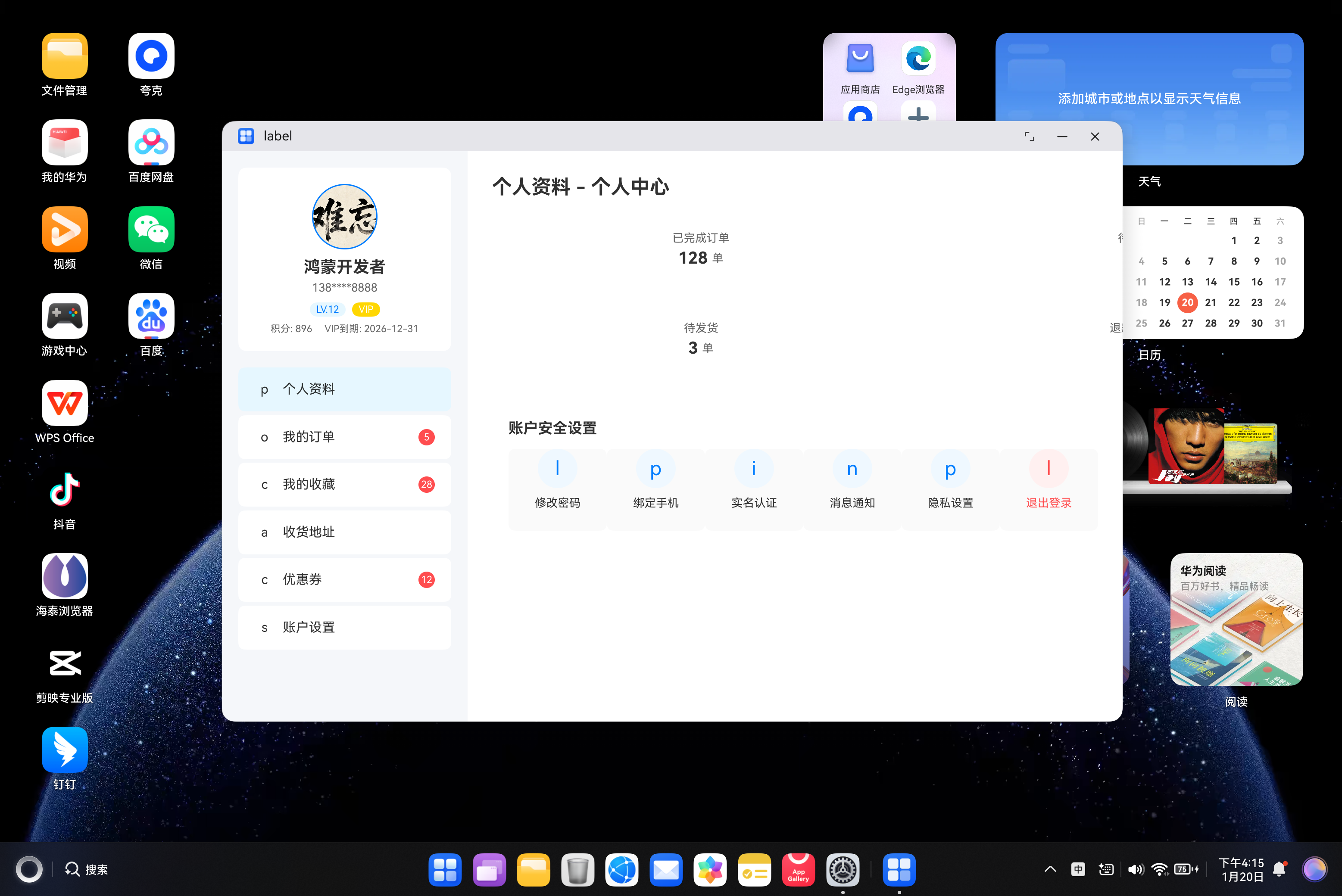
本文基于 鸿蒙 PC 真机环境,通过一个完整的「鸿蒙开发者应用 · 个人中心页面」案例,系统梳理了从界面设计、状态建模、组件拆分,到 PC 交互适配及常见 Bug 优化的全过程。
二、开源鸿蒙原生开发实践要点
本案例完全基于 ArkTS + ArkUI 声明式开发模式,遵循开源鸿蒙推荐的组件化与状态驱动思想,整体实现过程中重点体现了以下几个核心原则:
-
数据结构先行
- 明确定义
UserInfo、MenuItem、StatItem等接口 - 让 UI 与业务数据形成强类型绑定,减少后期维护成本
- 明确定义
-
状态即视图
- 使用
@State管理用户信息、菜单选中态、提示信息 - 通过状态变化自动驱动 UI 更新,避免手动刷新
- 使用
-
PC 场景优先布局
- 采用左右分栏结构(侧边栏 + 主内容区)
- 宽度、间距、阴影、悬浮效果均贴近桌面应用使用习惯
-
组件复用与 Builder 抽象
- 将“设置项”抽象为
@Builder方法 - 降低重复代码,提高可维护性
- 将“设置项”抽象为
三、核心代码设计思路解析
// 定义用户信息类型接口
interface UserInfo {
  avatar: string;
  nickname: string;
  phone: string;
  level: number;
  integral: number;
  vipExpire: string;
}

// 定义菜单选项类型接口
interface MenuItem {
  id: string;
  title: string;
  icon: string;
  count?: number;
}

// 定义数据统计项类型接口
interface StatItem {
  id: string;
  label: string;
  value: number | string;
  unit?: string;
}

@Entry
@Component
struct PersonalCenter {
  // 定义响应式状态
  @State userInfo: UserInfo = {
    avatar: 'app.media.nanwang', // 头像占位图
    nickname: '鸿蒙开发者',
    phone: '138****8888',
    level: 12,
    integral: 896,
    vipExpire: '2026-12-31'
  };

  @State activeMenuId: string = 'profile'; // 当前选中的菜单ID
  @State isVip: boolean = true; // 是否为VIP用户

  // 功能菜单列表
  @State menuList: MenuItem[] = [
    { id: 'profile', title: '个人资料', icon: 'icon-profile' },
    { id: 'order', title: '我的订单', icon: 'icon-order', count: 5 },
    { id: 'collect', title: '我的收藏', icon: 'icon-collect', count: 28 },
    { id: 'address', title: '收货地址', icon: 'icon-address' },
    { id: 'coupon', title: '优惠券', icon: 'icon-coupon', count: 12 },
    { id: 'setting', title: '账户设置', icon: 'icon-setting' }
  ];

  // 数据统计列表
  @State statList: StatItem[] = [
    { id: 'stat1', label: '已完成订单', value: 128, unit: '单' },
    { id: 'stat2', label: '待评价', value: 8, unit: '单' },
    { id: 'stat3', label: '待发货', value: 3, unit: '单' },
    { id: 'stat4', label: '退款/售后', value: 2, unit: '单' }
  ];

  // 菜单点击事件
  onMenuClick(menuId: string): void {
    this.activeMenuId = menuId;
    // 模拟路由跳转逻辑
    console.log(`跳转到${menuId}页面`);
  }

  // 刷新用户信息
  refreshUserInfo(): void {
    // 模拟接口请求刷新数据
    this.userInfo.integral += 10;
    this.userInfo.level += 1;
    this.messageTips = '信息已刷新';
    setTimeout(() => {
      this.messageTips = '';
    }, 2000);
  }

  // 提示消息
  @State messageTips: string = '';

  build() {
    // 整体布局:左右分栏
    Row() {
      // 左侧侧边栏(宽度固定)
      Column() {
        // 个人信息卡片
        Column() {
          // 头像
          Image($r('app.media.nanwang'))
            .width(80)
            .height(80)
            .borderRadius(40)
            .border({ width: 2, color: '#007DFF' })
            .margin({ bottom:
              this.refreshUserInfo(); // 点击头像刷新信息
            })

          // 昵称和手机号
          Text(this.userInfo.nickname)
            .fontSize(20)
            .fontWeight(FontWeight.Bold)
            .margin({ bottom: 5 })

          Text(this.userInfo.phone)
            .fontSize(14)
            .fontColor('#666')
            .margin({ bottom: 10 })

          // 等级和VIP标识
          Row() {
            Text(`LV.${this.userInfo.level}`)
              .fontSize(12)
              .backgroundColor('#E6F7FF')
              .fontColor('#007DFF')
              .padding({ left: 8, right: 8, top: 2, bottom: 2 })
              .borderRadius(10)
              .margin({ right: 8 })

            if (this.isVip) {
              Text('VIP')
                .fontSize(12)
                .backgroundColor('#FFD700')
                .fontColor('#FFFFFF')
                .padding({ left: 8, right: 8, top: 2, bottom: 2 })
                .borderRadius(10)
            }
          }

          // 积分和VIP到期时间
          Row() {
            Text(`积分: ${this.userInfo.integral}`)
              .fontSize(12)
              .fontCoright: 15 })

            if (this.isVip) {
              Text(`VIP到期: ${this.userInfo.vipExpire}`)
                .fontSize(12)
                .fontColor('#666')
            }
          }
          .margin({ top: 8 })
        }
        .width('100%')
        .padding(20)
        .backgroundColor('#FFFFFF')
        .borderRadius(10)
        .shadow({ radius: 5, color: '#00000010', offsetX: 0, offsetY: 2 })
        .margin({ bottom: 20 })

        // 功能菜单列表
        List() {
          ForEach(this.menuList, (item: MenuItem) => {
            ListItem() {
              Row() {
                // 菜单图标(占位)
                Text(item.icon.charAt(5)) // 简化图标展示
                  .fontSize(16)
                  .width(24)
                  .heig{ right: 10 })

                Text(item.title)
                  .fontSize(16)
                  .flexGrow(1)

                // 消息数量角标
                if (item.count) {
                  Text(item.count.toString())
                    .fontSize(12)
                    .back
                    .height(20)
                    .textAlign(TextAlign.Center)
                    .borderRadius(10)
                }
              }
              .width('100%')
              .padding({ left: 20, right: 20, top: 15, bottom: 15 })
              .backgroundColor(this.activeMenuId === item.id ? '#E6F7FF' : '#FFFFFF')
              .borderRadius(8)
              .onClick(uClick(item.id);
              })
              // PC端鼠标悬浮效果
              .hoverEffect(HoverEffect.Scale)
            }
            .margin({ bottom: 5 })
          })
        }
        .width('100%')
        .height('100%')
      }
      .width(300)
      .padding(20)
      .backgroundColor('#F5F7FA')
      .height('100%')

      // 右侧主内容区(自适应宽度)
      Column() {
        // 提示息
        if (this.messageTips) {
          Text(this.messageTips)
            .fontSize(14)
            .fontColor('#FFFFFF')
            .backgrondColor('#52C41A')
            .padding({ left: 15, right: 15, top: 8, bottom: 8 })
            .borderRadius(5)
            .margin({ bottom: 20 })
            .alignSelf(ItemAlign.Center)
        }

        // 页面标题
        Text(`${this.getMenuTitle()} - 个人中心`)
          .fontSize(24)
          .fontWeight(FontWeight.Bold)
          .margin({ bottom: 20 })
          .alignSel(ItemAlign.Start)

        // 数据统计面板
        Grid() {
          ForEach(this.statList, (item: StatItem) => {
            GridItem() {
              Column() {
                Text(item.label)
                  .ontSize(14)
                  .fontColor('#666')
                  .margin({ bottom: 5 })

                Row() {
                  Text(item.value.toString())
                    .fontSize(20)
                    .fontWeight(FontWeight.Bold)
                    .fontColor('#333')

                  if (item.unit) {
                    Text(item.unit)
                      .fontSize(14)
                      .fontColor('#666')
                      .margin({ left: 5 })
                  }
                }
              }
              .width('100%')
              .height('100%')
              .backgrRadius(10)
              .shadow({ radius: 3, color: '#00000008', offsetX: 0, offsetY: 1 })
              .padding(20)
            }
          })
        }
        .columnsTemplate('1fr 1fr')
        .columnsGap(20)
        .rowsGap(20)
        .rowTemplate('1fr 1fr')
        .width('100%')
        .height(200)
        .margin({ bottom: 30 })

        // 功能操作区
        Column() {
          Text('账户安全设置')
            .fontSize(18)
            .fontWeight(FontWeight.Bold)
            .mrgin({ bottom: 15 })
            .alignSelf(ItemAlign.Start)

          // 安全设置选项
          Flex({ wrap: FlexWrap.Wrap }) {
            this.renderettingItem('修改密码', 'icon-lock', () => console.log('修改密码'))
            this.renderSetingItem('绑定手机', 'icon-phone', () => console.log('绑定手机'))
            this.renderSttingItem('实名认证', 'icon-idcard', () => console.log('实名认证'))
            this.renderSettingItem('消息通知', 'icon-notice', () => console.log('消息通知'))
            this.renderSetingItem('隐私设置', 'icon-privacy', () => console.log('隐私设置'))
            this.renderSttingItem('退出登录', 'icon-logout', () => console.log('退出登录'), true)
          }
          .width('100%')
        }
        .width('100%')
        .padding(20)
        .backgroundColor('#FFFFFF')
        .bordeRadius(10)
        .shadow({ radius: 5, color: '#00000010', offsetX: 0, offsetY: 2 })
      }
      .width('100%')
      .padding(30)
      .backgroundColor('#FFFFFF')
      .height('100%')
    }
    .width('100%')
    .height('100%')
    .backgroundColor('#F5F7FA')
  }

  // 获取当前菜单标题
  getMenuTitle(): string {
    const activeMenu = this.menuList.find(item => item.id === this.activeMenuId);
    return activeMenu ? activeMenu.title : '个人资料';
  }

  // 渲染设置项组件
  @Builder
  renderSettingItem(title: string, icon: string, onClick: () => void, isDanger = false) {
    Column() {
      Text(icon.charAt(5)) // 简化图标展示
        .fontSize(24)
        .width(48)
        .heght(48)
        .textAlign(TextAlign.Center)
        .backgroundColor(isDanger ? '#FFF1F0' : '#F0F8FF')
        .fontColor(isDanger ? '#FF4D4F' : '#007DFF')
        .borderRadius(24)
        .margin({ bottom: 10 })

      Text(title)
        .fontSize(14)
        .fontColor(isDanger ? '#FF4D4F' : '#333')
    }
    .width(120)
    .height(100)
    .backgroundColor('#FAFAFA')
    .borderRadius(8)
    .margin({ bottom: 15 })
    .onClick(onClick)
    .hoverEffect(HoverEffect.Scale) // PC端悬浮缩放效果
  }
}
1. 整体布局结构
页面采用 Row 作为根布局,分为左右两大区域:
-
左侧侧边栏(固定宽度)
- 个人信息卡片
- 功能菜单列表
-
右侧主内容区(自适应宽度)
- 页面标题
- 数据统计面板(Grid)
- 账户安全与功能操作区
这种结构在 PC 端具有极强的扩展性,后续可无缝增加二级页面或复杂业务模块。
2. 个人信息卡片实现要点
个人信息区域集成了多个常见业务元素:
- 头像点击刷新用户信息(模拟接口行为)
- 等级、VIP 标识的条件渲染
- 积分与 VIP 到期时间展示
通过 @State userInfo 与 isVip 状态,实现了:
- 点击头像 → 状态更新 → UI 自动刷新
- 条件组件(
if (this.isVip))在 ArkUI 中的规范用法
这一部分非常适合真实业务中接入网络请求或本地缓存数据。
3. 功能菜单与选中态管理
左侧菜单通过 List + ForEach 渲染,核心亮点包括:
- 使用
activeMenuId管理当前选中项 - 点击菜单后动态高亮背景
- 支持消息数量角标(订单数、优惠券数等)
在 PC 端额外加入:
hoverEffect(HoverEffect.Scale)
明显提升鼠标操作的交互反馈,符合桌面应用体验预期。
4. 数据统计面板(Grid)
统计区采用 Grid 布局,展示订单、待评价、待发货等信息:
- 使用
StatItem数据模型统一管理 - 支持数值 + 单位组合显示
- 通过阴影与卡片样式强化信息层级
这种实现方式非常适合后续对接真实订单数据或埋点统计。
5. 设置项 Builder 抽象
账户安全设置区域通过 @Builder renderSettingItem 统一渲染:
- 支持普通操作与危险操作(如退出登录)
- 通过参数控制颜色、背景与点击行为
- 减少重复布局代码,增强可读性
这一模式在开源鸿蒙项目中非常值得推广,尤其适合组件型 UI。
四、鸿蒙 PC 真机运行效果
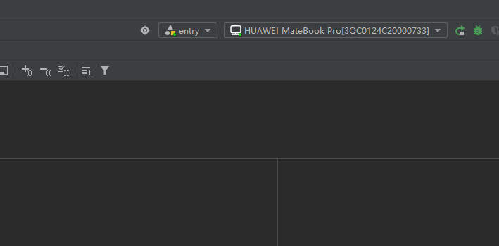
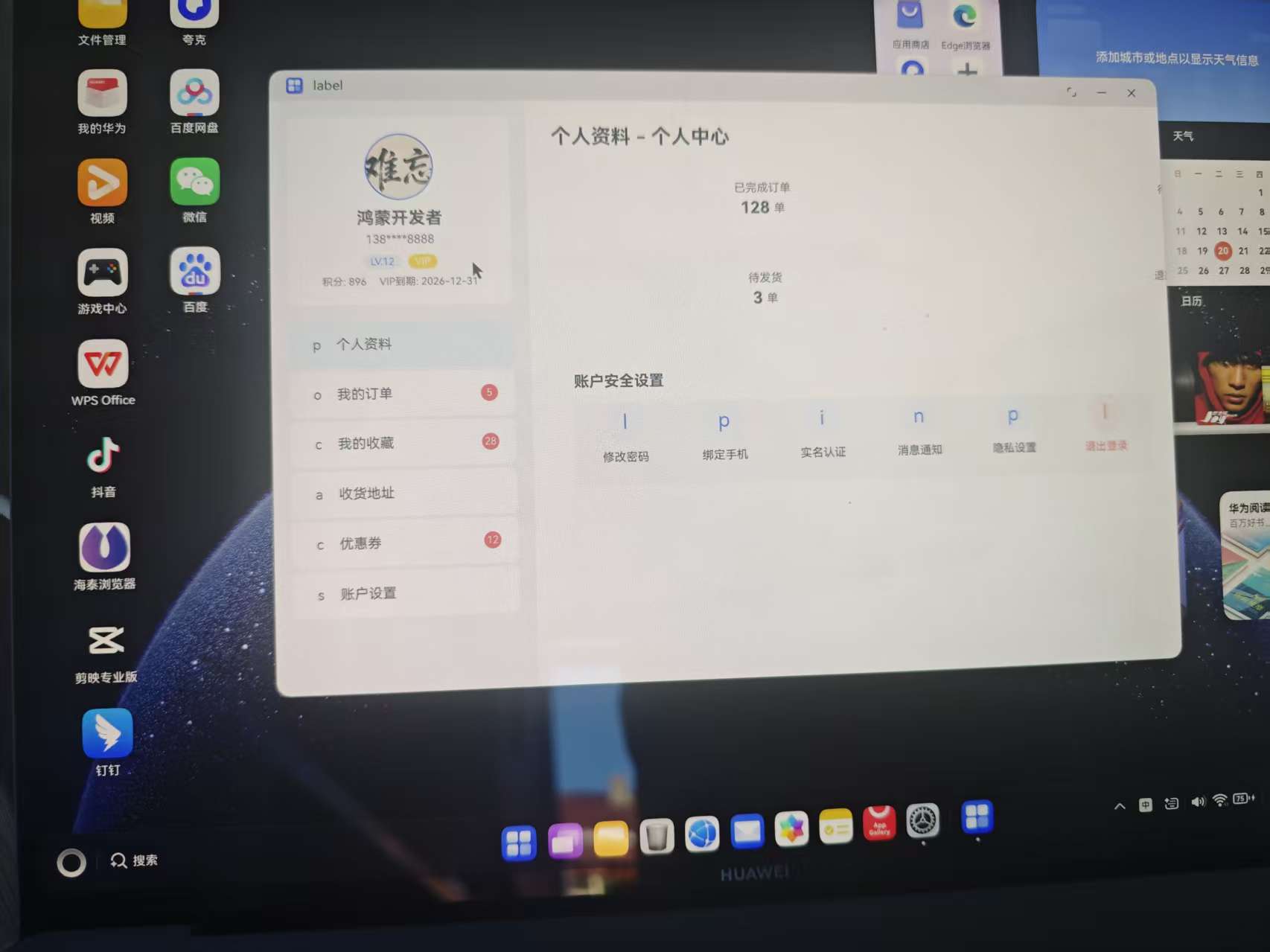
在 HarmonyOS PC 真机 上运行后,整体效果表现稳定:
- 页面渲染完整,无明显卡顿
- 鼠标悬浮、点击反馈流畅
- 布局在大屏下比例协调,无拉伸或错位问题
- 状态切换(菜单、提示信息)响应及时
尤其是在 PC 场景下,ArkUI 的声明式布局与 Grid / Flex 组合,已经能够支撑接近传统桌面应用的复杂界面需求。
五、常见 Bug 与优化总结
在开发与调试过程中,重点关注并优化了以下问题:
-
状态未声明导致 UI 不更新
- 确保所有动态数据均使用
@State管理
- 确保所有动态数据均使用
-
List / Grid 高度溢出问题
- 明确设置容器高度,避免 PC 大屏下布局异常
-
条件渲染空值问题
- 对
count、unit等字段进行安全判断
- 对
-
交互反馈不足
- 为 PC 端补充
hoverEffect,显著提升体验
- 为 PC 端补充
这些问题在移动端不明显,但在 PC 端尤为关键,是鸿蒙 PC 开发中需要特别注意的细节。

六、心得与总结
通过本次 鸿蒙 PC 真机运行 + 开源鸿蒙原生开发个人中心案例 的完整实践,可以明显感受到:
- ArkUI 在复杂页面构建上的成熟度正在快速提升
- 声明式 UI + 状态驱动模型非常适合多设备统一开发
- 鸿蒙 PC 已具备承载中大型业务应用的基础能力
对于开发者而言,现在正是深入探索 OpenHarmony PC 应用形态 的关键阶段。像“个人中心”这样真实且复杂的业务模块,是检验鸿蒙原生开发能力、沉淀工程经验的绝佳练兵场。
随着生态的持续完善,鸿蒙 PC 原生应用在企业级与生产力场景中,值得持续投入与长期布局。
欢迎加入开源鸿蒙PC社区:https://harmonypc.csdn.net/

赋能鸿蒙PC开发者,共建全场景原生生态,共享一次开发多端部署创新价值。
更多推荐
 16
16 0
0- 0



 已为社区贡献36条内容

所有评论(0)