鸿蒙PC UI控件库 - Label 基础标签详解
·
视频演示地址:
https://www.bilibili.com/video/BV1jomdBBE4H/
📋 目录
概述
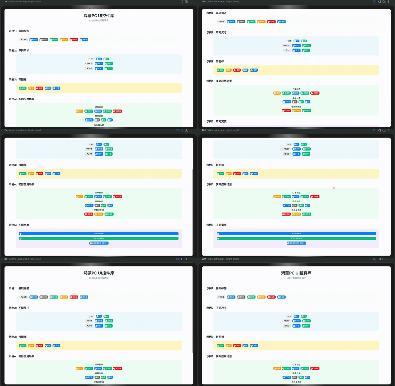
Label 是控件库中的基础标签组件,支持多种尺寸、颜色、图标等功能,适用于状态标识、分类标签、优先级标记等场景。
设计理念
基础标签采用简洁清晰设计,具有以下特点:
- 多种颜色:支持 default、primary、secondary、success、warning、error、info 等颜色
- 多种尺寸:支持 small、medium、large 三种尺寸
- 图标支持:支持显示文字图标
- 品牌标识:左下角自动包含品牌标识(圆圈红字"PC")
- 主题统一:所有样式配置都在代码中,方便定制
适用场景
- 状态标识:订单状态、任务状态、审核状态等
- 分类标签:商品分类、内容分类、标签分类等
- 优先级标记:任务优先级、重要程度等
- 信息展示:简单的信息标签展示
特性
✨ 核心特性
- ✅ 多种颜色:支持 7 种颜色类型(default、primary、secondary、success、warning、error、info)
- ✅ 多种尺寸:支持 small、medium、large 三种尺寸
- ✅ 图标支持:支持显示文字图标(emoji、特殊字符)
- ✅ 灵活宽度:支持固定宽度、百分比宽度、自适应宽度
- ✅ 品牌标识:自动包含左下角品牌标识
- ✅ 主题配置:所有样式都可通过代码配置
🎨 视觉特点
- 默认颜色:灰色背景 + 灰色边框 + 深色文字
- 主题颜色:彩色背景 + 白色文字(无边框)
- 尺寸变化:字体大小、内边距、高度随尺寸变化
- 图标显示:图标显示在文字左侧
快速开始
基础用法
import { Label } from '../components/base'

@Entry
@Component
struct MyPage {
  build() {
    Column({ space: 20 }) {
      // 基础标签
      Label({ text: '默认标签' })

      // 带颜色的标签
      Label({ text: '主要标签', color: 'primary' })
      Label({ text: '成功标签', color: 'success' })
      Label({ text: '警告标签', color: 'warning' })
      Label({ text: '错误标签', color: 'error' })

      // 带图标的标签
      Label({
        text: '成功',
        color: 'success',
        showIcon: true,
        textIcon: '✓'
      })
    }
    .width('100%')
    .height('100%')
    .padding(20)
    .justifyContent(FlexAlign.Center)
  }
}
API 参考
Props
| 属性名 | 类型 | 默认值 | 说明 |
|---|---|---|---|
text | string | '' | 标签文本(必需) |
color | LabelColor | 'default' | 标签颜色类型 |
labelSize | 'small' | 'medium' | 'large' | 'medium' | 标签尺寸 |
showIcon | boolean | false | 是否显示图标 |
textIcon | string? | undefined | 图标文本(文字图标) |
showBrand | boolean | true | 是否显示品牌标识 |
labelWidth | string | number? | undefined | 标签宽度(不设置则自适应) |
LabelColor 类型
type LabelColor = 'default' | 'primary' | 'secondary' | 'success' | 'warning' | 'error' | 'info'
| 颜色类型 | 说明 | 背景色 | 文字色 |
|---|---|---|---|
default | 默认 | 浅灰色 | 深色 |
primary | 主要 | 主题色 | 白色 |
secondary | 次要 | 灰色 | 白色 |
success | 成功 | 绿色 | 白色 |
warning | 警告 | 橙色 | 白色 |
error | 错误 | 红色 | 白色 |
info | 信息 | 蓝色 | 白色 |
尺寸规格
| 尺寸 | 字体大小 | 高度 | 内边距(左右) | 图标大小 |
|---|---|---|---|---|
small | 12vp | 24vp | 8vp | 14vp |
medium | 14vp | 28vp | 10vp | 16vp |
large | 16vp | 32vp | 12vp | 18vp |
使用示例
1. 基础标签
@Entry
@Component
struct LabelExample1 {
  build() {
    Column({ space: 15 }) {
      Label({ text: '默认标签' })
      Label({ text: '主要标签', color: 'primary' })
      Label({ text: '次要标签', color: 'secondary' })
      Label({ text: '成功标签', color: 'success' })
      Label({ text: '警告标签', color: 'warning' })
      Label({ text: '错误标签', color: 'error' })
      Label({ text: '信息标签', color: 'info' })
    }
    .width('100%')
    .padding(20)
  }
}
2. 不同尺寸
@Entry
@Component
struct LabelExample2 {
  build() {
    Column({ space: 15 }) {
      Row({ space: 15 }) {
        Label({ text: '小尺寸', labelSize: 'small' })
        Label({ text: '小尺寸', labelSize: 'small', color: 'primary' })
        Label({ text: '小尺寸', labelSize: 'small', color: 'success' })
      }

      Row({ space: 15 }) {
        Label({ text: '中等尺寸', labelSize: 'medium' })
        Label({ text: '中等尺寸', labelSize: 'medium', color: 'primary' })
        Label({ text: '中等尺寸', labelSize: 'medium', color: 'success' })
      }

      Row({ space: 15 }) {
        Label({ text: '大尺寸', labelSize: 'large' })
        Label({ text: '大尺寸', labelSize: 'large', color: 'primary' })
        Label({ text: '大尺寸', labelSize: 'large', color: 'success' })
      }
    }
    .width('100%')
    .padding(20)
  }
}
3. 带图标
@Entry
@Component
struct LabelExample3 {
  build() {
    Row({ space: 15 }) {
      Label({
        text: '成功',
        color: 'success',
        showIcon: true,
        textIcon: '✓'
      })
      Label({
        text: '警告',
        color: 'warning',
        showIcon: true,
        textIcon: '⚠'
      })
      Label({
        text: '错误',
        color: 'error',
        showIcon: true,
        textIcon: '✕'
      })
      Label({
        text: '信息',
        color: 'info',
        showIcon: true,
        textIcon: 'ℹ'
      })
      Label({
        text: '主要',
        color: 'primary',
        showIcon: true,
        textIcon: '★'
      })
    }
    .width('100%')
    .padding(20)
    .flexWrap(FlexWrap.Wrap)
  }
}
4. 订单状态标签
@Entry
@Component
struct OrderStatusLabels {
  build() {
    Column({ space: 20 }) {
      Text('订单状态')
        .fontSize(20)
        .fontWeight(FontWeight.Bold)

      Row({ space: 10 }) {
        Label({ text: '待支付', color: 'warning', showIcon: true, textIcon: '⏰' })
        Label({ text: '已支付', color: 'success', showIcon: true, textIcon: '✓' })
        Label({ text: '已发货', color: 'info', showIcon: true, textIcon: '📦' })
        Label({ text: '已完成', color: 'success', showIcon: true, textIcon: '✓' })
        Label({ text: '已取消', color: 'error', showIcon: true, textIcon: '✕' })
      }
      .flexWrap(FlexWrap.Wrap)
    }
    .width('100%')
    .padding(30)
  }
}
5. 商品分类标签
@Entry
@Component
struct CategoryLabels {
  build() {
    Column({ space: 20 }) {
      Text('商品分类')
        .fontSize(20)
        .fontWeight(FontWeight.Bold)

      Row({ space: 10 }) {
        Label({ text: '电子产品', color: 'primary' })
        Label({ text: '服装', color: 'secondary' })
        Label({ text: '食品', color: 'success' })
        Label({ text: '图书', color: 'info' })
        Label({ text: '家居', color: 'warning' })
      }
      .flexWrap(FlexWrap.Wrap)
    }
    .width('100%')
    .padding(30)
  }
}
6. 任务优先级标签
@Entry
@Component
struct PriorityLabels {
  build() {
    Column({ space: 20 }) {
      Text('任务优先级')
        .fontSize(20)
        .fontWeight(FontWeight.Bold)

      Row({ space: 10 }) {
        Label({ text: '高优先级', color: 'error', showIcon: true, textIcon: '🔴' })
        Label({ text: '中优先级', color: 'warning', showIcon: true, textIcon: '🟡' })
        Label({ text: '低优先级', color: 'success', showIcon: true, textIcon: '🟢' })
      }
      .flexWrap(FlexWrap.Wrap)
    }
    .width('100%')
    .padding(30)
  }
}
7. 不同宽度
@Entry
@Component
struct LabelWidthExample {
  build() {
    Column({ space: 15 }) {
      Label({
        text: '固定宽度标签',
        color: 'primary',
        labelWidth: 200
      })

      Label({
        text: '百分比宽度标签',
        color: 'success',
        labelWidth: '80%'
      })

      Label({
        text: '自适应宽度标签(默认)',
        color: 'info'
      })
    }
    .width('100%')
    .padding(20)
  }
}
8. 审核状态标签
@Entry
@Component
struct ReviewStatusLabels {
  build() {
    Column({ space: 20 }) {
      Text('审核状态')
        .fontSize(20)
        .fontWeight(FontWeight.Bold)

      Row({ space: 10 }) {
        Label({ text: '待审核', color: 'warning', showIcon: true, textIcon: '⏳' })
        Label({ text: '审核中', color: 'info', showIcon: true, textIcon: '🔄' })
        Label({ text: '已通过', color: 'success', showIcon: true, textIcon: '✓' })
        Label({ text: '已拒绝', color: 'error', showIcon: true, textIcon: '✕' })
      }
      .flexWrap(FlexWrap.Wrap)
    }
    .width('100%')
    .padding(30)
  }
}
9. 用户角色标签
@Entry
@Component
struct UserRoleLabels {
  build() {
    Column({ space: 20 }) {
      Text('用户角色')
        .fontSize(20)
        .fontWeight(FontWeight.Bold)

      Row({ space: 10 }) {
        Label({ text: '管理员', color: 'error', showIcon: true, textIcon: '👑' })
        Label({ text: '编辑', color: 'primary', showIcon: true, textIcon: '✏️' })
        Label({ text: '作者', color: 'info', showIcon: true, textIcon: '✍️' })
        Label({ text: '访客', color: 'secondary' })
      }
      .flexWrap(FlexWrap.Wrap)
    }
    .width('100%')
    .padding(30)
  }
}
10. 组合使用示例
@Entry
@Component
struct LabelCombinationExample {
  build() {
    Column({ space: 30 }) {
      // 订单信息卡片
      Column({ space: 15 }) {
        Text('订单 #12345')
          .fontSize(18)
          .fontWeight(FontWeight.Bold)

        Row({ space: 10 }) {
          Label({ text: '已支付', color: 'success', showIcon: true, textIcon: '✓' })
          Label({ text: '已发货', color: 'info', showIcon: true, textIcon: '📦' })
          Label({ text: '电子产品', color: 'primary' })
        }
        .flexWrap(FlexWrap.Wrap)
      }
      .width('100%')
      .padding(20)
      .backgroundColor('#F9FAFB')
      .borderRadius(8)

      // 任务信息卡片
      Column({ space: 15 }) {
        Text('任务:完成项目文档')
          .fontSize(18)
          .fontWeight(FontWeight.Bold)

        Row({ space: 10 }) {
          Label({ text: '高优先级', color: 'error', showIcon: true, textIcon: '🔴' })
          Label({ text: '进行中', color: 'info', showIcon: true, textIcon: '🔄' })
          Label({ text: '开发', color: 'primary' })
        }
        .flexWrap(FlexWrap.Wrap)
      }
      .width('100%')
      .padding(20)
      .backgroundColor('#F9FAFB')
      .borderRadius(8)
    }
    .width('100%')
    .padding(30)
  }
}
主题配置
Label 的所有样式都通过 ComponentTheme 配置,所有配置都在代码中,不依赖JSON文件。
修改默认颜色
import { ComponentTheme } from '../theme/ComponentTheme'

// 修改主色(影响 primary 颜色)
ComponentTheme.PRIMARY_COLOR = '#007AFF'

// 修改错误色(影响 error 颜色)
ComponentTheme.ERROR_COLOR = '#FF3B30'

// 修改边框颜色(影响 default 颜色的边框)
ComponentTheme.BORDER_COLOR = '#E5E5E5'

// 修改圆角
ComponentTheme.BORDER_RADIUS = 8
自定义颜色
如果需要自定义颜色,可以修改 Label.ets 中的颜色定义:
// 在 Label.ets 中修改 getBackgroundColor() 方法
private getBackgroundColor(): string {
  switch (this.color) {
    case 'success': {
      return '#10B981'  // 修改成功色
    }
    case 'warning': {
      return '#F59E0B'  // 修改警告色
    }
    // ... 其他颜色
  }
}
最佳实践
1. 颜色选择
推荐:根据语义选择颜色
- default:用于一般信息、中性标签
- primary:用于主要操作、重要信息
- secondary:用于次要信息
- success:用于成功状态、完成状态
- warning:用于警告状态、待处理状态
- error:用于错误状态、失败状态
- info:用于信息提示、进行中状态
2. 尺寸选择
推荐:根据使用场景选择尺寸
- small:用于紧凑空间、列表项、表格中
- medium:默认尺寸,适用于大多数场景
- large:用于重要信息、大屏幕显示
3. 图标使用
- 语义化图标:使用与文字语义相关的图标
- 简洁图标:使用简单的文字图标(✓、✕、⚠等)
- 统一风格:保持图标风格统一
4. 宽度设置
- 自适应:大多数情况下使用自适应宽度(不设置
labelWidth) - 固定宽度:需要对齐时使用固定宽度
- 百分比宽度:需要响应式布局时使用百分比宽度
5. 组合使用
- 状态组合:多个状态标签可以组合使用
- 分类组合:多个分类标签可以组合使用
- 信息层次:使用不同颜色区分信息层次
常见问题
Q1: 如何自定义标签颜色?
A: 修改 Label.ets 中的 getBackgroundColor() 和 getTextColor() 方法,或者扩展 LabelColor 类型:
// 在 Label.ets 中添加新颜色
export type LabelColor = 'default' | 'primary' | 'custom'

// 在 getBackgroundColor() 中添加处理
case 'custom': {
  return '#YOUR_COLOR'
}
Q2: 如何隐藏品牌标识?
A: 设置 showBrand: false:
Label({
  text: '标签',
  showBrand: false
})
Q3: 如何设置标签宽度?
A: 使用 labelWidth 属性:
Label({
  text: '标签',
  labelWidth: 200  // 固定宽度
})

Label({
  text: '标签',
  labelWidth: '80%'  // 百分比宽度
})
Q4: 图标不显示怎么办?
A: 确保同时设置 showIcon: true 和 textIcon 属性:
Label({
  text: '标签',
  showIcon: true,  // 必须设置为 true
  textIcon: '✓'    // 必须提供图标文本
})
Q5: 如何实现点击事件?
A: Label 组件本身不支持点击事件,如果需要可点击的标签,可以使用 Tag 组件(后续会实现),或者在外层包裹 Button:
Button() {
  Label({ text: '可点击标签', color: 'primary' })
}
.type(ButtonType.Normal)
.backgroundColor('transparent')
.border({ width: 0 })
Q6: 如何实现多行标签?
A: Label 组件是单行显示,如果需要多行,可以使用多个 Label 组合,或者使用 Tag 组件(支持换行)。
总结
Label 是控件库中的基础标签组件,具有以下核心特性:
- 多种颜色:支持 7 种颜色类型,满足不同场景需求
- 多种尺寸:支持 small、medium、large 三种尺寸
- 图标支持:支持显示文字图标,增强视觉效果
- 灵活宽度:支持固定宽度、百分比宽度、自适应宽度
- 易于使用:简单的 API,开箱即用
- 主题配置:所有样式都可通过代码配置
- 品牌标识:自动包含品牌标识,保持视觉统一
关键要点
- ✅ 使用
color属性选择颜色类型 - ✅ 使用
labelSize属性选择尺寸 - ✅ 使用
showIcon和textIcon显示图标 - ✅ 使用
labelWidth设置宽度 - ✅ 根据语义选择合适的颜色
- ✅ 通过
ComponentTheme自定义全局样式
适用场景
- 状态标识(订单状态、任务状态等)
- 分类标签(商品分类、内容分类等)
- 优先级标记(任务优先级、重要程度等)
- 信息展示(简单的信息标签展示)
下一篇预告:Badge(徽章标签)详解
本文档属于《鸿蒙PC UI控件库开发系列文章》第12篇
欢迎加入开源鸿蒙PC社区:https://harmonypc.csdn.net/

赋能鸿蒙PC开发者,共建全场景原生生态,共享一次开发多端部署创新价值。
更多推荐
 15
15 0
0- 0


 已为社区贡献55条内容

所有评论(0)