鸿蒙PC UI控件库 - SearchInput 搜索输入框详解
·
视频演示地址:
https://www.bilibili.com/video/BV1jomdBBE4H/
📋 目录
概述
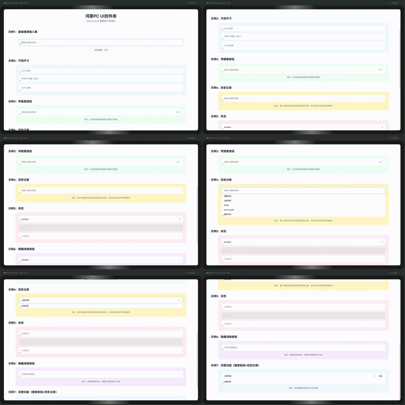
SearchInput 是控件库中专用于搜索场景的输入框组件,支持清除按钮、历史记录、搜索按钮等功能,适用于搜索框、筛选输入、快速查找等场景。
设计理念
搜索输入框采用便捷高效设计,具有以下特点:
- 搜索图标:左侧自动显示搜索图标,直观明了
- 清除按钮:支持一键清除输入内容
- 历史记录:支持显示搜索历史,快速复用
- 搜索按钮:支持显示搜索按钮,明确操作
- 品牌标识:左下角自动包含品牌标识(圆圈红字"PC")
- 主题统一:所有样式配置都在代码中,方便定制
适用场景
- 搜索功能:全局搜索、内容搜索
- 筛选输入:数据筛选、条件输入
- 快速查找:列表查找、表格搜索
- 历史复用:搜索历史、常用关键词
特性
✨ 核心特性
- ✅ 搜索图标:左侧自动显示搜索图标
- ✅ 清除按钮:支持一键清除输入内容
- ✅ 搜索按钮:支持显示搜索按钮(可选)
- ✅ 历史记录:支持显示搜索历史列表
- ✅ 历史过滤:根据输入内容过滤历史记录
- ✅ 多种尺寸:支持 small、medium、large 三种尺寸
- ✅ 状态管理:支持禁用、只读等状态
- ✅ 品牌标识:自动包含左下角品牌标识
- ✅ 主题配置:所有样式都可通过代码配置
🎨 视觉特点
- 正常状态:白色背景 + 灰色边框 + 搜索图标
- 聚焦状态:主色边框高亮
- 禁用状态:灰色背景 + 灰色文字 + 灰色边框
- 只读状态:正常样式但不可编辑
- 历史记录:下拉列表显示,支持点击选择
快速开始
基础用法
import { SearchInput } from '../components/base'

@Entry
@Component
struct MyPage {
  @State searchValue: string = ''

  build() {
    Column({ space: 20 }) {
      // 基础搜索输入框
      SearchInput({
        value: $searchValue,
        placeholder: '请输入搜索关键词'
      })

      // 带搜索按钮的搜索输入框
      SearchInput({
        value: $searchValue,
        placeholder: '请输入搜索关键词',
        showSearchButton: true
      })

      // 带历史记录的搜索输入框
      SearchInput({
        value: $searchValue,
        placeholder: '请输入搜索关键词',
        showHistory: true,
        historyItems: [
          { text: '鸿蒙开发' },
          { text: 'UI控件库' },
          { text: 'ArkTS' }
        ]
      })
    }
    .width('100%')
    .height('100%')
    .padding(20)
    .justifyContent(FlexAlign.Center)
  }
}
关于双向绑定
SearchInput 使用 @Link 实现双向绑定,需要使用 $variableName 语法:
@State searchValue: string = ''

SearchInput({
  value: $searchValue  // 使用 $ 创建双向绑定
})
API 参考
Props
| 属性名 | 类型 | 默认值 | 说明 |
|---|---|---|---|
value | @Link string | - | 搜索值(必需,双向绑定) |
placeholder | string | '请输入搜索关键词' | 占位符文本 |
inputSize | 'small' | 'medium' | 'large' | 'medium' | 输入框尺寸 |
disabled | boolean | false | 是否禁用 |
readonly | boolean | false | 是否只读 |
showClearButton | boolean | true | 是否显示清除按钮 |
showSearchButton | boolean | false | 是否显示搜索按钮 |
showHistory | boolean | false | 是否显示历史记录 |
historyItems | SearchHistoryItem[] | [] | 历史记录列表 |
maxHistoryCount | number | 10 | 最大历史记录数 |
showBrand | boolean | true | 是否显示品牌标识 |
inputWidth | string | number | '100%' | 输入框宽度 |
SearchHistoryItem 接口
| 属性名 | 类型 | 说明 |
|---|---|---|
text | string | 历史记录文本(必需) |
timestamp | number? | 时间戳(可选) |
尺寸规格
| 尺寸 | 高度 | 字体大小 | 图标大小 | 内边距(左右) |
|---|---|---|---|---|
small | 48vp | 14vp | 18vp | 12vp |
medium | 60vp | 16vp | 20vp | 14vp |
large | 72vp | 18vp | 24vp | 16vp |
使用示例
1. 基础搜索输入框
@Entry
@Component
struct SearchExample1 {
  @State searchValue: string = ''

  build() {
    Column({ space: 15 }) {
      SearchInput({
        value: $searchValue,
        placeholder: '请输入搜索关键词'
      })

      Text(`当前搜索:${this.searchValue || '(空)'}`)
        .fontSize(14)
        .fontColor('#666')
    }
    .width('100%')
    .padding(20)
  }
}
2. 带搜索按钮
@Entry
@Component
struct SearchExample2 {
  @State searchValue: string = ''

  build() {
    Column({ space: 15 }) {
      SearchInput({
        value: $searchValue,
        placeholder: '请输入搜索关键词',
        showSearchButton: true
      })

      Text('提示:点击搜索按钮或按回车键执行搜索')
        .fontSize(14)
        .fontColor('#666')
    }
    .width('100%')
    .padding(20)
  }
}
3. 历史记录
@Entry
@Component
struct SearchExample3 {
  @State searchValue: string = ''
  @State historyItems: SearchHistoryItem[] = [
    { text: '鸿蒙开发', timestamp: Date.now() - 3600000 },
    { text: 'UI控件库', timestamp: Date.now() - 7200000 },
    { text: 'ArkTS', timestamp: Date.now() - 10800000 }
  ]

  build() {
    Column({ space: 15 }) {
      SearchInput({
        value: $searchValue,
        placeholder: '请输入搜索关键词',
        showHistory: true,
        historyItems: this.historyItems,
        maxHistoryCount: 5
      })

      Text('提示:输入关键词时会显示匹配的历史记录')
        .fontSize(14)
        .fontColor('#666')
    }
    .width('100%')
    .padding(20)
  }
}
4. 不同尺寸
@Entry
@Component
struct SearchExample4 {
  @State search1: string = ''
  @State search2: string = ''
  @State search3: string = ''

  build() {
    Column({ space: 15 }) {
      SearchInput({
        value: $search1,
        placeholder: '小尺寸搜索',
        inputSize: 'small'
      })

      SearchInput({
        value: $search2,
        placeholder: '中等尺寸搜索(默认)',
        inputSize: 'medium'
      })

      SearchInput({
        value: $search3,
        placeholder: '大尺寸搜索',
        inputSize: 'large'
      })
    }
    .width('100%')
    .padding(20)
  }
}
5. 状态管理
@Entry
@Component
struct SearchExample5 {
  @State search1: string = ''
  @State search2: string = '禁用搜索'
  @State search3: string = '只读搜索'

  build() {
    Column({ space: 15 }) {
      SearchInput({
        value: $search1,
        placeholder: '正常状态'
      })

      SearchInput({
        value: $search2,
        placeholder: '请输入搜索关键词',
        disabled: true
      })

      SearchInput({
        value: $search3,
        placeholder: '请输入搜索关键词',
        readonly: true
      })
    }
    .width('100%')
    .padding(20)
  }
}
6. 隐藏清除按钮
@Entry
@Component
struct SearchExample6 {
  @State searchValue: string = ''

  build() {
    Column({ space: 15 }) {
      SearchInput({
        value: $searchValue,
        placeholder: '不显示清除按钮',
        showClearButton: false
      })

      Text('提示:隐藏清除按钮后,需要手动删除输入内容')
        .fontSize(14)
        .fontColor('#666')
    }
    .width('100%')
    .padding(20)
  }
}
7. 完整功能示例
@Entry
@Component
struct SearchExample7 {
  @State searchValue: string = ''
  @State historyItems: SearchHistoryItem[] = [
    { text: '鸿蒙开发', timestamp: Date.now() - 3600000 },
    { text: 'UI控件库', timestamp: Date.now() - 7200000 },
    { text: 'ArkTS', timestamp: Date.now() - 10800000 },
    { text: 'HarmonyOS', timestamp: Date.now() - 14400000 },
    { text: '组件开发', timestamp: Date.now() - 18000000 }
  ]

  build() {
    Column({ space: 15 }) {
      SearchInput({
        value: $searchValue,
        placeholder: '请输入搜索关键词',
        showSearchButton: true,
        showHistory: true,
        historyItems: this.historyItems,
        maxHistoryCount: 5
      })

      Text('提示:支持搜索按钮和历史记录功能')
        .fontSize(14)
        .fontColor('#666')
    }
    .width('100%')
    .padding(20)
  }
}
8. 搜索页面示例
@Entry
@Component
struct SearchPage {
  @State searchValue: string = ''
  @State searchResults: string[] = []
  @State historyItems: SearchHistoryItem[] = []

  private performSearch() {
    if (this.searchValue.trim().length > 0) {
      // 执行搜索逻辑
      this.searchResults = ['结果1', '结果2', '结果3']

      // 添加到历史记录
      const newItem: SearchHistoryItem = {
        text: this.searchValue,
        timestamp: Date.now()
      }
      this.historyItems = [newItem, ...this.historyItems].slice(0, 10)
    }
  }

  build() {
    Column({ space: 20 }) {
      Text('搜索')
        .fontSize(24)
        .fontWeight(FontWeight.Bold)

      SearchInput({
        value: $searchValue,
        placeholder: '请输入搜索关键词',
        showSearchButton: true,
        showHistory: true,
        historyItems: this.historyItems,
        maxHistoryCount: 5
      })

      if (this.searchResults.length > 0) {
        Column({ space: 10 }) {
          Text('搜索结果')
            .fontSize(18)
            .fontWeight(FontWeight.Bold)

          ForEach(this.searchResults, (result: string) => {
            Text(result)
              .fontSize(16)
              .fontColor('#333')
              .padding(10)
              .width('100%')
              .backgroundColor('#F5F5F5')
              .borderRadius(8)
          })
        }
        .width('100%')
      }
    }
    .width('100%')
    .padding(30)
  }
}
主题配置
SearchInput 的所有样式都通过 ComponentTheme 配置,所有配置都在代码中,不依赖JSON文件。
修改默认颜色
import { ComponentTheme } from '../theme/ComponentTheme'

// 修改主色(影响聚焦状态的边框颜色)
ComponentTheme.PRIMARY_COLOR = '#007AFF'

// 修改错误色(影响错误状态的边框和提示颜色)
ComponentTheme.ERROR_COLOR = '#FF3B30'

// 修改边框颜色
ComponentTheme.BORDER_COLOR = '#E5E5E5'

// 修改圆角
ComponentTheme.BORDER_RADIUS = 8
批量配置
import { ComponentTheme } from '../theme/ComponentTheme'

// 使用 setTheme 方法批量配置
ComponentTheme.setTheme({
  primaryColor: '#007AFF',
  errorColor: '#FF3B30',
  borderRadius: 8,
  spacing: 16
})
最佳实践
1. 尺寸选择
推荐:根据使用场景选择尺寸
- small:用于紧凑空间、导航栏搜索
- medium:默认尺寸,适用于大多数场景
- large:用于重要搜索或大屏幕显示
2. 搜索按钮
- 默认关闭:
showSearchButton: false,适用于大多数场景 - 明确操作:需要明确搜索操作时,开启搜索按钮
- 回车搜索:支持回车键触发搜索,无需按钮
3. 历史记录
- 自动过滤:根据输入内容自动过滤历史记录
- 数量限制:使用
maxHistoryCount限制显示数量 - 时间戳:可选添加时间戳,用于排序和显示
4. 清除按钮
- 默认开启:
showClearButton: true,方便快速清除 - 特殊场景:可以关闭清除按钮,强制用户手动删除
5. 历史记录管理
- 本地存储:可以将历史记录保存到本地存储
- 去重处理:添加新历史记录时去重
- 数量限制:限制历史记录总数,避免过多
6. 搜索触发
- 实时搜索:可以在
onChange中实现实时搜索 - 按钮搜索:点击搜索按钮或按回车键触发搜索
- 防抖处理:建议对实时搜索进行防抖处理
常见问题
Q1: 如何禁用清除按钮?
A: 设置 showClearButton: false:
SearchInput({
  value: $searchValue,
  showClearButton: false
})
Q2: 如何显示搜索按钮?
A: 设置 showSearchButton: true:
SearchInput({
  value: $searchValue,
  showSearchButton: true
})
Q3: 如何实现历史记录功能?
A: 使用 showHistory 和 historyItems 属性:
@State historyItems: SearchHistoryItem[] = [
  { text: '关键词1' },
  { text: '关键词2' }
]

SearchInput({
  value: $searchValue,
  showHistory: true,
  historyItems: this.historyItems
})
Q4: 如何限制历史记录数量?
A: 使用 maxHistoryCount 属性:
SearchInput({
  value: $searchValue,
  showHistory: true,
  historyItems: this.historyItems,
  maxHistoryCount: 5  // 最多显示5条
})
Q5: 如何设置输入框宽度?
A: 使用 inputWidth 属性:
SearchInput({
  value: $searchValue,
  inputWidth: 300  // 固定宽度
})

SearchInput({
  value: $searchValue,
  inputWidth: '100%'  // 百分比宽度
})
Q6: 如何实现搜索功能?
A: 可以在外部监听 value 变化或使用搜索按钮:
@State searchValue: string = ''

SearchInput({
  value: $searchValue,
  showSearchButton: true
})

// 在 aboutToUpdate 或其他地方处理搜索
aboutToUpdate() {
  if (this.searchValue.trim().length > 0) {
    // 执行搜索逻辑
    this.performSearch(this.searchValue)
  }
}
Q7: 历史记录如何持久化?
A: 可以使用本地存储:
// 保存历史记录
localStorage.setItem('searchHistory', JSON.stringify(this.historyItems))

// 读取历史记录
const saved = localStorage.getItem('searchHistory')
if (saved) {
  this.historyItems = JSON.parse(saved)
}
总结
SearchInput 是控件库中专用于搜索场景的输入框组件,具有以下核心特性:
- 搜索图标:左侧自动显示搜索图标,直观明了
- 清除按钮:支持一键清除输入内容
- 搜索按钮:支持显示搜索按钮,明确操作
- 历史记录:支持显示搜索历史,快速复用
- 易于使用:简单的 API,开箱即用
- 主题配置:所有样式都可通过代码配置
- 品牌标识:自动包含品牌标识,保持视觉统一
关键要点
- ✅ 使用
$variableName创建双向绑定 - ✅ 使用
showSearchButton显示搜索按钮 - ✅ 使用
showHistory和historyItems显示历史记录 - ✅ 使用
showClearButton控制清除按钮显示 - ✅ 使用
inputSize属性选择合适尺寸 - ✅ 通过
ComponentTheme自定义全局样式
适用场景
- 搜索功能
- 筛选输入
- 快速查找
- 历史复用
下一篇预告:TextArea(多行文本输入)详解
本文档属于《鸿蒙PC UI控件库开发系列文章》第10篇
欢迎加入开源鸿蒙PC社区:https://harmonypc.csdn.net/

赋能鸿蒙PC开发者,共建全场景原生生态,共享一次开发多端部署创新价值。
更多推荐
 11
11 0
0- 0


 已为社区贡献55条内容

所有评论(0)