鸿蒙PC UI控件库 - SecondaryButton 次要按钮详解
视频演示地址:
📋 目录
概述
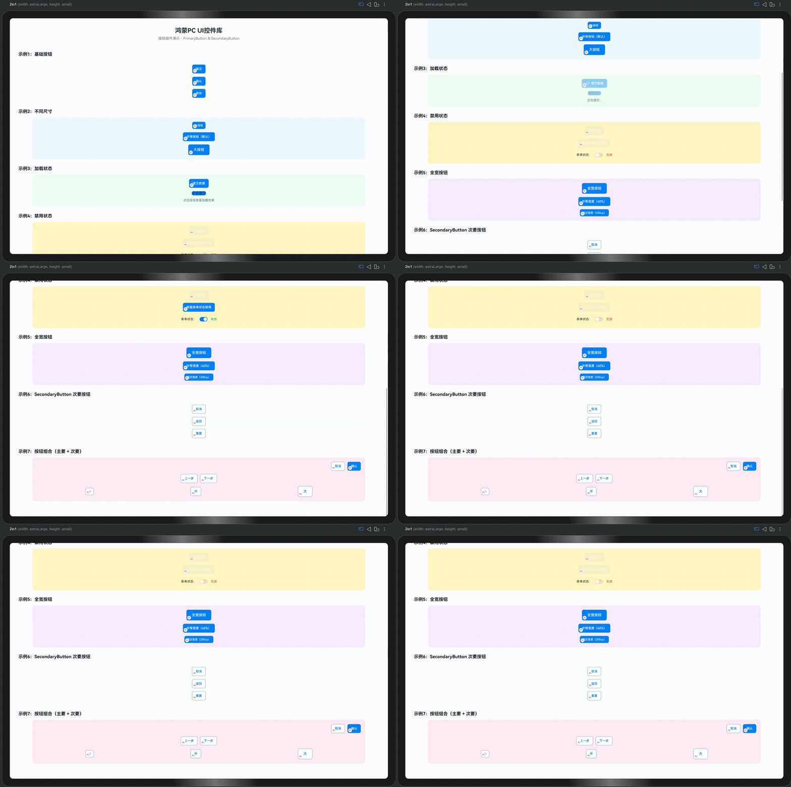
SecondaryButton 是控件库中的次要按钮组件,适用于次要操作场景。与 PrimaryButton 的主要区别在于:
- PrimaryButton:实心背景,用于主要操作(如"提交"、“确认”)
- SecondaryButton:边框样式,用于次要操作(如"取消"、“返回”)
设计理念
次要按钮采用边框样式设计,具有以下特点:
- 视觉层次:通过边框而非实心背景,降低视觉权重
- 操作区分:与主要按钮形成明确的视觉对比
- 品牌标识:左下角自动包含品牌标识(圆圈红字"PC")
- 主题统一:所有样式配置都在代码中,方便定制
特性
✨ 核心特性
- ✅ 边框样式:带边框的次要按钮,无实心背景
- ✅ 多种尺寸:支持 small、medium、large 三种尺寸
- ✅ 图标支持:支持左侧或右侧图标
- ✅ 加载状态:内置加载动画
- ✅ 禁用状态:支持禁用状态,自动调整样式
- ✅ 品牌标识:自动包含左下角品牌标识
- ✅ 主题配置:所有样式都可通过代码配置
🎨 视觉特点
- 正常状态:蓝色边框 + 蓝色文字 + 白色背景
- 悬停状态:浅蓝色背景(通过系统自动处理)
- 按下状态:更深的背景色
- 禁用状态:灰色边框 + 灰色文字 + 50% 透明度
快速开始
基础用法
import { SecondaryButton } from '../components/base'

@Entry
@Component
struct MyPage {
  build() {
    Column({ space: 20 }) {
      // 基础次要按钮
      SecondaryButton({
        text: '取消'
      })

      // 带图标的次要按钮
      SecondaryButton({
        text: '返回',
        icon: $r('app.media.icon_back'),
        iconPosition: 'left'
      })
    }
    .width('100%')
    .height('100%')
    .padding(20)
    .justifyContent(FlexAlign.Center)
  }
}
关于点击事件处理
SecondaryButton 的 onClickBuilder 属性是 @BuilderParam 类型,需要使用 @Builder 或 @LocalBuilder 方法初始化。在实际项目中,推荐使用以下方式处理点击事件:
- 状态管理方式:通过
@State变量和普通Button的onClick来处理 - 自定义事件系统:创建自定义事件处理机制
- @Builder 方法:如果需要使用
onClickBuilder,需要定义@Builder方法
本文档中的示例主要展示按钮的视觉效果和样式配置,点击事件处理可以通过上述方式实现。
与 PrimaryButton 配合使用
@Entry
@Component
struct ButtonGroupExample {
  // 点击事件处理
  handleCancel() {
    console.info('取消操作')
  }

  handleConfirm() {
    console.info('确认操作')
  }

  build() {
    Row({ space: 12 }) {
      // 次要操作
      SecondaryButton({
        text: '取消'
      })

      // 主要操作
      PrimaryButton({
        text: '确认'
      })
    }
    .width('100%')
    .justifyContent(FlexAlign.End)
  }
}
注意:onClickBuilder 是 @BuilderParam 类型,需要使用 @Builder 或 @LocalBuilder 方法初始化。如果需要处理点击事件,建议通过状态管理或自定义事件系统实现。
API 参考
Props
| 属性名 | 类型 | 默认值 | 说明 |
|---|---|---|---|
text | string | '按钮' | 按钮文字 |
icon | ResourceStr? | undefined | 按钮图标(可选) |
iconPosition | 'left' | 'right' | 'left' | 图标位置 |
buttonSize | 'small' | 'medium' | 'large' | 'medium' | 按钮尺寸 |
loading | boolean | false | 是否加载中 |
disabled | boolean | false | 是否禁用 |
showBrand | boolean | true | 是否显示品牌标识 |
buttonWidth | string | number? | undefined | 按钮宽度(可选) |
buttonHeight | string | number? | undefined | 按钮高度(可选) |
onClickBuilder | @BuilderParam () => void? | undefined | 点击事件回调(需要使用 @Builder 或 @LocalBuilder 方法) |
尺寸规格
| 尺寸 | 高度 | 字体大小 | 图标大小 | 内边距 |
|---|---|---|---|---|
small | 32vp | 12vp | 16vp | 12vp × 6vp |
medium | 40vp | 14vp | 20vp | 16vp × 8vp |
large | 48vp | 16vp | 24vp | 24vp × 12vp |
使用示例
1. 基础按钮
@Entry
@Component
struct ButtonExample1 {
  build() {
    Column({ space: 15 }) {
      SecondaryButton({
        text: '取消'
      })

      SecondaryButton({
        text: '返回'
      })

      SecondaryButton({
        text: '上一步'
      })
    }
    .width('100%')
    .height('100%')
    .padding(20)
    .justifyContent(FlexAlign.Center)
  }
}
2. 不同尺寸
@Entry
@Component
struct ButtonExample2 {
  build() {
    Column({ space: 15 }) {
      SecondaryButton({
        text: '小按钮',
        buttonSize: 'small'
      })

      SecondaryButton({
        text: '中等按钮',
        buttonSize: 'medium'
      })

      SecondaryButton({
        text: '大按钮',
        buttonSize: 'large'
      })
    }
    .width('100%')
    .height('100%')
    .padding(20)
    .justifyContent(FlexAlign.Center)
  }
}
3. 图标按钮
@Entry
@Component
struct ButtonExample3 {
  build() {
    Column({ space: 15 }) {
      // 左侧图标
      SecondaryButton({
        text: '下载',
        icon: $r('app.media.icon_download'),
        iconPosition: 'left'
      })

      // 右侧图标
      SecondaryButton({
        text: '下一步',
        icon: $r('app.media.icon_arrow_right'),
        iconPosition: 'right'
      })

      // 仅图标(通过空文字实现)
      SecondaryButton({
        text: '',
        icon: $r('app.media.icon_settings'),
        buttonWidth: 40,
        buttonHeight: 40
      })
    }
    .width('100%')
    .height('100%')
    .padding(20)
    .justifyContent(FlexAlign.Center)
  }
}
4. 加载状态
@Entry
@Component
struct ButtonExample4 {
  @State loading: boolean = false

  // 处理保存操作
  handleSave() {
    this.loading = true
    // 模拟异步操作
    setTimeout(() => {
      this.loading = false
      console.info('保存完成')
    }, 2000)
  }

  build() {
    Column({ space: 20 }) {
      SecondaryButton({
        text: '保存',
        loading: this.loading
      })

      // 使用普通按钮触发加载状态
      Button() {
        Text(this.loading ? '保存中...' : '点击保存')
      }
      .onClick(() => {
        this.handleSave()
      })
      .enabled(!this.loading)

      Text('点击按钮查看加载状态')
        .fontSize(12)
        .fontColor('#999999')
    }
    .width('100%')
    .height('100%')
    .padding(20)
    .justifyContent(FlexAlign.Center)
  }
}
说明:由于 onClickBuilder 需要使用 @Builder 方法,这里使用普通 Button 来演示点击事件处理。实际项目中,可以通过状态管理或自定义事件系统来处理按钮点击。
5. 禁用状态
@Entry
@Component
struct ButtonExample5 {
  @State formValid: boolean = false

  build() {
    Column({ space: 20 }) {
      SecondaryButton({
        text: '重置',
        disabled: !this.formValid
      })

      Text('表单验证通过后才能重置')
        .fontSize(12)
        .fontColor('#999999')
    }
    .width('100%')
    .height('100%')
    .padding(20)
    .justifyContent(FlexAlign.Center)
  }
}
6. 按钮组合
@Entry
@Component
struct ButtonExample6 {
  build() {
    Column({ space: 20 }) {
      // 左右对齐的按钮组
      Row({ space: 12 }) {
        SecondaryButton({
          text: '取消',
          buttonSize: 'medium'
        })

        PrimaryButton({
          text: '确认',
          buttonSize: 'medium'
        })
      }
      .width('100%')
      .justifyContent(FlexAlign.End)

      // 居中对齐的按钮组
      Row({ space: 12 }) {
        SecondaryButton({
          text: '上一步',
          buttonSize: 'medium'
        })

        SecondaryButton({
          text: '下一步',
          buttonSize: 'medium'
        })
      }
      .width('100%')
      .justifyContent(FlexAlign.Center)
    }
    .width('100%')
    .height('100%')
    .padding(20)
  }
}
7. 自定义宽度
@Entry
@Component
struct ButtonExample7 {
  build() {
    Column({ space: 15 }) {
      SecondaryButton({
        text: '全宽按钮',
        buttonWidth: '100%',
        buttonSize: 'large'
      })

      SecondaryButton({
        text: '中等宽度(60%)',
        buttonWidth: '60%',
        buttonSize: 'medium'
      })

      SecondaryButton({
        text: '固定宽度(200vp)',
        buttonWidth: 200,
        buttonSize: 'small'
      })
    }
    .width('100%')
    .height('100%')
    .padding(20)
    .justifyContent(FlexAlign.Center)
  }
}
8. 表单场景
@Entry
@Component
struct FormExample {
  @State formData: {
    name: string
    email: string
  } = { name: '', email: '' }

  @State submitting: boolean = false

  // 重置表单
  handleReset() {
    this.formData = { name: '', email: '' }
  }

  // 提交表单
  handleSubmit() {
    if (!this.formData.name || !this.formData.email) {
      return
    }
    this.submitting = true
    // 模拟提交
    setTimeout(() => {
      this.submitting = false
      console.info('提交成功')
    }, 2000)
  }

  build() {
    Column({ space: 20 }) {
      // 表单内容
      TextInput({ placeholder: '姓名' })
        .onChange((value: string) => {
          this.formData.name = value
        })

      TextInput({ placeholder: '邮箱' })
        .onChange((value: string) => {
          this.formData.email = value
        })

      // 按钮组
      Row({ space: 12 }) {
        SecondaryButton({
          text: '重置',
          disabled: this.submitting
        })

        PrimaryButton({
          text: '提交',
          loading: this.submitting,
          disabled: !this.formData.name || !this.formData.email
        })
      }
      .width('100%')
      .justifyContent(FlexAlign.End)

      // 使用普通按钮处理点击事件
      Row({ space: 12 }) {
        Button('重置表单')
          .onClick(() => {
            this.handleReset()
          })
          .enabled(!this.submitting)

        Button('提交表单')
          .onClick(() => {
            this.handleSubmit()
          })
          .enabled(!this.submitting && this.formData.name && this.formData.email)
      }
      .width('100%')
      .justifyContent(FlexAlign.End)
    }
    .width('100%')
    .height('100%')
    .padding(20)
  }
}
说明:在实际项目中,可以通过状态管理或自定义事件系统来处理按钮点击事件。这里展示了如何通过普通 Button 来处理点击事件,同时使用 SecondaryButton 和 PrimaryButton 来展示视觉效果。
主题配置
SecondaryButton 的所有样式都通过 ComponentTheme 配置,所有配置都在代码中,不依赖JSON文件。
修改按钮颜色
import { ComponentTheme } from '../theme/ComponentTheme'

// 修改次要按钮文字颜色
ComponentTheme.SECONDARY_BUTTON_TEXT_COLOR = '#007AFF'

// 修改次要按钮边框颜色
ComponentTheme.SECONDARY_BUTTON_BORDER_COLOR = '#007AFF'

// 修改次要按钮悬停背景色
ComponentTheme.SECONDARY_BUTTON_BACKGROUND_HOVER = '#F0F7FF'

// 修改次要按钮按下背景色
ComponentTheme.SECONDARY_BUTTON_BACKGROUND_ACTIVE = '#E0EFFF'

// 修改禁用状态颜色
ComponentTheme.SECONDARY_BUTTON_TEXT_DISABLED = '#CCCCCC'
ComponentTheme.SECONDARY_BUTTON_BORDER_DISABLED = '#E5E5E5'
批量配置
import { ComponentTheme } from '../theme/ComponentTheme'

// 使用 setTheme 方法批量配置
ComponentTheme.setTheme({
  primaryColor: '#007AFF',
  borderRadius: 8,
  spacing: 16
})
自定义主题
// 在应用启动时配置
import { ComponentTheme } from './theme/ComponentTheme'

// 设置自定义次要按钮颜色
ComponentTheme.SECONDARY_BUTTON_TEXT_COLOR = '#34C759'  // 绿色
ComponentTheme.SECONDARY_BUTTON_BORDER_COLOR = '#34C759'
ComponentTheme.SECONDARY_BUTTON_BACKGROUND_HOVER = '#F0F9F4'
最佳实践
1. 按钮组合使用
推荐:主要操作使用 PrimaryButton,次要操作使用 SecondaryButton
Row({ space: 12 }) {
  SecondaryButton({ text: '取消' })
  PrimaryButton({ text: '确认' })
}
2. 尺寸选择
- small:用于紧凑空间,如表格操作列
- medium:默认尺寸,适用于大多数场景
- large:用于重要操作或大屏幕显示
3. 图标使用
- 使用图标增强按钮的可识别性
- 常用操作使用标准图标(如返回、下载、设置)
- 图标位置根据阅读习惯选择(中文:左侧,英文:根据上下文)
4. 加载状态
- 异步操作时显示加载状态
- 加载期间自动禁用按钮
- 操作完成后恢复按钮状态
5. 禁用状态
- 根据表单验证状态动态禁用
- 提供明确的禁用原因提示
- 避免频繁切换禁用状态
6. 响应式设计
- 使用百分比宽度适配不同屏幕
- 在小屏幕上考虑使用全宽按钮
- 保持按钮之间的合理间距
常见问题
Q1: SecondaryButton 和 PrimaryButton 有什么区别?
A: 主要区别在于视觉样式:
- PrimaryButton:实心背景,用于主要操作
- SecondaryButton:边框样式,用于次要操作
功能上两者基本相同,都支持图标、加载、禁用等状态。
Q2: 如何隐藏品牌标识?
A: 设置 showBrand: false:
SecondaryButton({
  text: '按钮',
  showBrand: false
})
注意:不推荐隐藏品牌标识,这会影响控件库的识别性。
Q3: 如何自定义按钮颜色?
A: 直接修改 ComponentTheme 中的静态属性:
ComponentTheme.SECONDARY_BUTTON_TEXT_COLOR = '#34C759'
ComponentTheme.SECONDARY_BUTTON_BORDER_COLOR = '#34C759'
Q4: 如何处理按钮点击事件?
A: onClickBuilder 是 @BuilderParam 类型,需要使用 @Builder 或 @LocalBuilder 方法。推荐使用状态管理或自定义事件系统:
@Entry
@Component
struct MyPage {
  @State count: number = 0

  // 方式1:使用状态管理
  handleClick() {
    this.count++
    console.info('按钮被点击')
  }

  // 方式2:使用 @Builder 方法(如果需要使用 onClickBuilder)
  @Builder
  onClickHandler() {
    this.count++
    console.info('按钮被点击')
  }

  build() {
    Column({ space: 20 }) {
      // 使用普通按钮处理点击
      Button('点击我')
        .onClick(() => {
          this.handleClick()
        })

      // 使用 SecondaryButton 展示样式
      SecondaryButton({
        text: '次要按钮'
      })

      Text(`点击次数:${this.count}`)
    }
    .width('100%')
    .height('100%')
    .padding(20)
  }
}
Q5: 如何实现按钮的悬停效果?
A: HarmonyOS 系统会自动处理按钮的悬停效果,无需手动实现。如果需要自定义,可以通过修改 ComponentTheme 中的悬停颜色配置。
Q6: 按钮文字可以换行吗?
A: 按钮文字默认不换行。如果需要多行文字,建议使用其他组件(如 TextButton)或自定义实现。
总结
SecondaryButton 是控件库中的次要按钮组件,具有以下核心特性:
- 视觉层次:通过边框样式降低视觉权重
- 功能完整:支持图标、加载、禁用等多种状态
- 尺寸灵活:三种尺寸满足不同场景需求
- 易于使用:简单的 API,开箱即用
- 主题配置:所有样式都可通过代码配置
- 品牌标识:自动包含品牌标识,保持视觉统一
关键要点
- ✅ 使用
buttonSize属性选择合适尺寸 - ✅ 使用
loading属性处理异步操作 - ✅ 使用
disabled属性控制按钮状态 - ✅ 通过
ComponentTheme自定义样式 - ✅ 与
PrimaryButton配合使用,形成清晰的视觉层次
适用场景
- 表单中的"取消"、"重置"按钮
- 对话框中的次要操作按钮
- 列表中的次要操作按钮
- 需要降低视觉权重的操作按钮
下一篇预告:TextButton(文本按钮)详解
本文档属于《鸿蒙PC UI控件库开发系列文章》第3篇
欢迎加入开源鸿蒙PC社区:https://harmonypc.csdn.net/

赋能鸿蒙PC开发者,共建全场景原生生态,共享一次开发多端部署创新价值。
更多推荐
 24
24 0
0- 0


 已为社区贡献55条内容

所有评论(0)