Electron for OpenHarmony 实战:Button 按钮组件实现PC适配
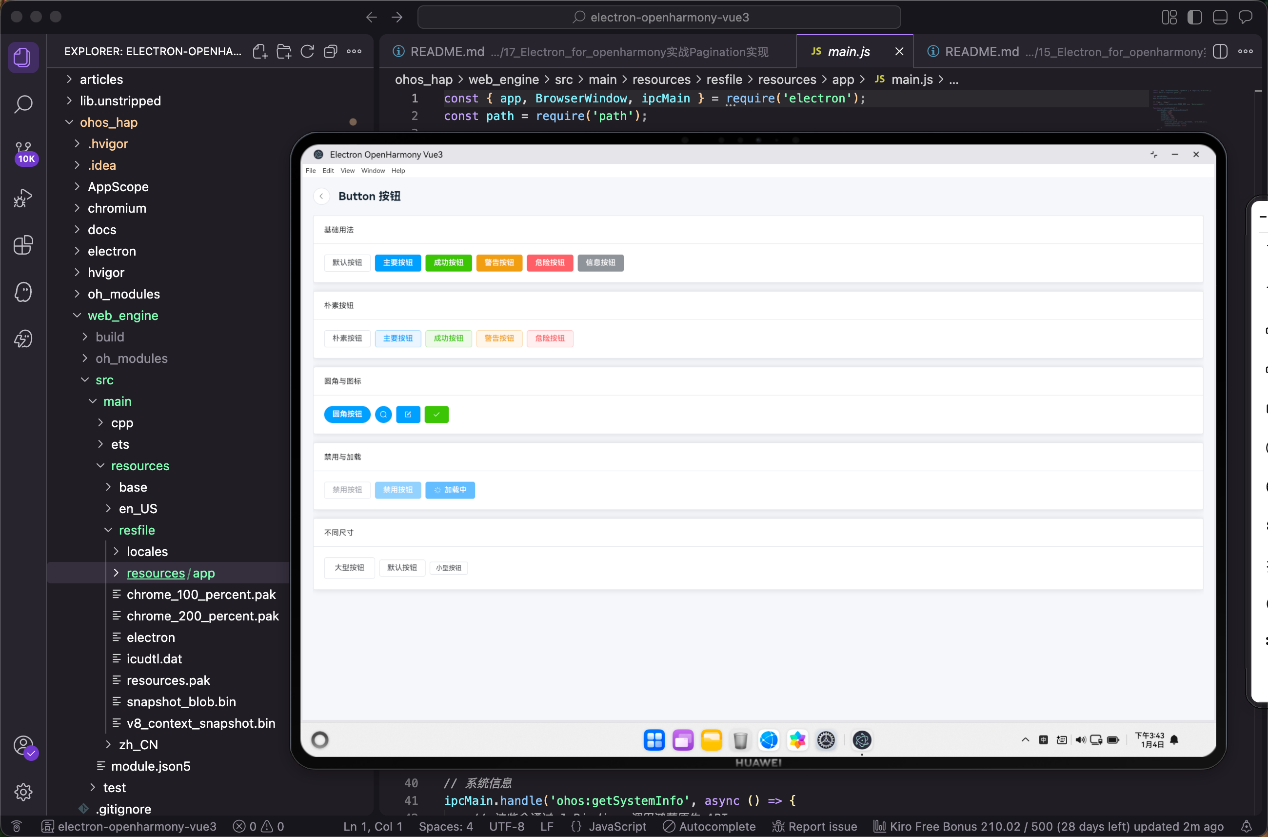
最近在做一个基于 Electron for OpenHarmony 的跨平台项目,需要搭建一套完整的 UI 组件展示系统。今天先从最基础的 Button 按钮组件开始,记录一下整个实现过程。
项目背景
我们的项目采用 Vue3 + Element Plus 作为前端技术栈,通过 Electron 运行时让 Web 应用能够在 OpenHarmony 系统上运行。整个架构分为几层:最上层是 Vue3 应用层,中间是 Electron + Preload 桥接层,最底层是 HarmonyOS 原生层。
在开始写组件之前,先把项目的依赖配置好。打开 package.json,确保已经安装了 Element Plus:
{
  "name": "electron-ohos-vue3",
  "version": "1.0.0",
  "description": "Electron + OpenHarmony + Vue3 应用框架",
  "type": "module",
  "scripts": {
    "dev": "vite",
    "build": "vite build",
    "preview": "vite preview"
  },
  "dependencies": {
    "vue": "^3.4.0",
    "vue-router": "^4.2.0",
    "pinia": "^2.1.0",
    "element-plus": "^2.4.0",
    "@element-plus/icons-vue": "^2.3.0"
  },
  "devDependencies": {
    "@vitejs/plugin-vue": "^5.0.0",
    "vite": "^5.0.0",
    "typescript": "^5.3.0",
    "vue-tsc": "^1.8.0"
  }
}
这里用到了 element-plus 和 @element-plus/icons-vue 两个包,前者是组件库本身,后者是配套的图标库。
入口文件配置
接下来在 main.ts 中全局注册 Element Plus。这一步很关键,如果漏掉了后面组件就用不了:
import { createApp } from 'vue'
import { createPinia } from 'pinia'
import ElementPlus from 'element-plus'
import 'element-plus/dist/index.css'
import * as ElementPlusIconsVue from '@element-plus/icons-vue'
import router from './router'
import App from './App.vue'
import './styles/global.css'

const app = createApp(App)

// 注册所有图标
for (const [key, component] of Object.entries(ElementPlusIconsVue)) {
  app.component(key, component)
}

app.use(createPinia())
app.use(ElementPlus)
app.use(router)

app.mount('#app')
这段代码做了几件事:引入 Element Plus 和它的样式文件,然后通过 for...of 循环把所有图标组件都注册成全局组件。这样做的好处是后面用图标的时候不需要单独 import,直接写组件名就行。
路由配置
Button 组件页面需要配置路由才能访问到。在 router/index.ts 中添加对应的路由:
import { createRouter, createWebHashHistory } from 'vue-router'
import type { RouteRecordRaw } from 'vue-router'

const routes: RouteRecordRaw[] = [
  {
    path: '/',
    name: 'Home',
    component: () => import('../views/Home.vue'),
  },
  {
    path: '/components',
    name: 'Components',
    component: () => import('../views/components/ComponentsHome.vue'),
  },
  {
    path: '/components/button',
    name: 'ButtonDemo',
    component: () => import('../views/components/ButtonDemo.vue'),
  },
  // ... 其他路由
]

const router = createRouter({
  history: createWebHashHistory(),
  routes,
})

export default router
这里用了 createWebHashHistory 而不是 createWebHistory,主要是考虑到在 Electron 环境下 hash 模式兼容性更好,不需要服务端配置。路由采用懒加载的方式,用 () => import() 动态导入组件,这样可以减少首屏加载时间。
组件首页实现
在进入具体的 Button 页面之前,我们先做一个组件列表首页,方便用户选择要查看的组件。创建 ComponentsHome.vue:
<script setup lang="ts">
import { useRouter } from 'vue-router'

const router = useRouter()

const components = [
  { name: 'Button', path: '/components/button', icon: 'Pointer', desc: '按钮组件' },
  { name: 'Input', path: '/components/input', icon: 'Edit', desc: '输入框组件' },
  { name: 'Select', path: '/components/select', icon: 'ArrowDown', desc: '选择器组件' },
  // ... 更多组件
]

const goTo = (path: string) => router.push(path)
const goBack = () => router.push('/')
</script>

<template>
  <div class="components-home">
    <div class="header">
      <el-button @click="goBack" :icon="'ArrowLeft'" circle />
      <h1>Element Plus 组件库</h1>
    </div>
    <div class="grid">
      <el-card v-for="item in components" :key="item.name" class="card" shadow="hover" @click="goTo(item.path)">
        <div class="card-content">
          <el-icon :size="32"><component :is="item.icon" /></el-icon>
          <h3>{{ item.name }}</h3>
          <p>{{ item.desc }}</p>
        </div>
      </el-card>
    </div>
  </div>
</template>
这个页面用 el-card 组件做成卡片网格布局,每个卡片展示一个组件的名称、图标和简介。点击卡片就跳转到对应的组件详情页。shadow="hover" 让卡片在鼠标悬停时才显示阴影,交互体验更好。
样式部分用 CSS Grid 实现自适应布局:
.components-home { padding: 20px; height: 100vh; overflow-y: auto; background: #f5f7fa; }
.header { display: flex; align-items: center; gap: 16px; margin-bottom: 24px; }
.header h1 { margin: 0; font-size: 24px; }
.grid { display: grid; grid-template-columns: repeat(auto-fill, minmax(160px, 1fr)); gap: 16px; }
.card { cursor: pointer; transition: transform 0.2s; }
.card:hover { transform: translateY(-4px); }
grid-template-columns: repeat(auto-fill, minmax(160px, 1fr)) 这行代码让卡片自动填充,每个卡片最小 160px,剩余空间平均分配。
Button 组件详情页
重头戏来了,下面是 ButtonDemo.vue 的完整实现:
<script setup lang="ts">
import { useRouter } from 'vue-router'
const router = useRouter()
</script>

<template>
  <div class="demo-page">
    <div class="demo-header">
      <el-button @click="router.push('/components')" :icon="'ArrowLeft'" circle />
      <h2>Button 按钮</h2>
    </div>
    <el-scrollbar height="calc(100vh - 80px)">
      <div class="demo-content">
        <el-card class="demo-card">
          <template #header>基础用法</template>
          <el-space wrap>
            <el-button>默认按钮</el-button>
            <el-button type="primary">主要按钮</el-button>
            <el-button type="success">成功按钮</el-button>
            <el-button type="warning">警告按钮</el-button>
            <el-button type="danger">危险按钮</el-button>
            <el-button type="info">信息按钮</el-button>
          </el-space>
        </el-card>
        <el-card class="demo-card">
          <template #header>朴素按钮</template>
          <el-space wrap>
            <el-button plain>朴素按钮</el-button>
            <el-button type="primary" plain>主要按钮</el-button>
            <el-button type="success" plain>成功按钮</el-button>
            <el-button type="warning" plain>警告按钮</el-button>
            <el-button type="danger" plain>危险按钮</el-button>
          </el-space>
        </el-card>
        <el-card class="demo-card">
          <template #header>圆角与图标</template>
          <el-space wrap>
            <el-button type="primary" round>圆角按钮</el-button>
            <el-button type="primary" :icon="'Search'" circle />
            <el-button type="primary" :icon="'Edit'" />
            <el-button type="success" :icon="'Check'" />
          </el-space>
        </el-card>
        <el-card class="demo-card">
          <template #header>禁用与加载</template>
          <el-space wrap>
            <el-button disabled>禁用按钮</el-button>
            <el-button type="primary" disabled>禁用按钮</el-button>
            <el-button type="primary" loading>加载中</el-button>
          </el-space>
        </el-card>
        <el-card class="demo-card">
          <template #header>不同尺寸</template>
          <el-space wrap>
            <el-button size="large">大型按钮</el-button>
            <el-button>默认按钮</el-button>
            <el-button size="small">小型按钮</el-button>
          </el-space>
        </el-card>
      </div>
    </el-scrollbar>
  </div>
</template>

<style scoped>
.demo-page { padding: 20px; background: #f5f7fa; height: 100vh; box-sizing: border-box; }
.demo-header { display: flex; align-items: center; gap: 16px; margin-bottom: 20px; }
.demo-header h2 { margin: 0; }
.demo-content { display: flex; flex-direction: column; gap: 16px; padding-bottom: 20px; }
.demo-card { margin-bottom: 0; }
</style>
这个页面展示了 Button 组件的五种常见用法。我来逐个说明一下:
基础用法部分展示了六种按钮类型。type 属性决定按钮的颜色主题,不传就是默认的白色按钮,primary 是蓝色主按钮,success 是绿色,warning 是橙色,danger 是红色,info 是灰色。实际开发中,主要操作用 primary,删除操作用 danger,这样用户一眼就能分辨操作的重要程度。
朴素按钮加了 plain 属性,按钮变成镂空样式,背景透明只有边框。这种按钮视觉上更轻量,适合次要操作或者按钮比较多的场景,避免页面太花哨。
圆角与图标部分演示了 round 和 circle 两个属性。round 让按钮变成圆角矩形,circle 直接变成圆形。圆形按钮一般配合图标使用,比如返回按钮、搜索按钮这种。:icon="'Search'" 这种写法是因为我们前面全局注册了图标组件,直接传组件名字符串就行。
禁用与加载展示了 disabled 和 loading 两个状态。禁用状态下按钮变灰且不可点击,加载状态会显示一个转圈的 loading 图标。提交表单的时候一般会用 loading 状态,防止用户重复点击。
不同尺寸通过 size 属性控制,有 large、默认、small 三种。大按钮适合移动端或者需要突出显示的场景,小按钮适合表格操作列这种空间紧凑的地方。
页面整体用 el-scrollbar 包裹,这是 Element Plus 提供的自定义滚动条组件,比原生滚动条好看。height="calc(100vh - 80px)" 让滚动区域高度等于视口高度减去头部高度。
el-space 组件用来处理按钮之间的间距,wrap 属性让按钮在空间不够时自动换行,不用手动写 flex-wrap。
按钮点击事件处理
光展示按钮还不够,实际项目中按钮肯定要绑定点击事件。我们可以给按钮加上一些交互逻辑,比如点击后弹出提示:
<script setup lang="ts">
import { useRouter } from 'vue-router'
import { ElMessage } from 'element-plus'

const router = useRouter()

const handleClick = (type: string) => {
  ElMessage({
    message: `你点击了${type}按钮`,
    type: 'success'
  })
}

const handleSubmit = () => {
  ElMessage.success('提交成功')
}

const handleDelete = () => {
  ElMessage.warning('确定要删除吗?')
}
</script>

<template>
  <el-space wrap>
    <el-button type="primary" @click="handleClick('主要')">主要按钮</el-button>
    <el-button type="success" @click="handleSubmit">提交</el-button>
    <el-button type="danger" @click="handleDelete">删除</el-button>
  </el-space>
</template>
@click 绑定点击事件,这是 Vue 的基础语法。ElMessage 是 Element Plus 提供的消息提示组件,可以通过 ElMessage.success()、ElMessage.warning() 这种快捷方式调用,也可以传一个配置对象自定义更多选项。
按钮组的使用
有时候需要把多个按钮组合在一起,比如分页器的上一页、下一页按钮。Element Plus 提供了 el-button-group 组件:
<template>
  <el-button-group>
    <el-button type="primary" :icon="'ArrowLeft'">上一页</el-button>
    <el-button type="primary">下一页<el-icon class="el-icon--right"><ArrowRight /></el-icon></el-button>
  </el-button-group>
</template>
按钮组会把相邻按钮的边框合并,看起来像一个整体。图标可以放在文字前面或后面,放后面的话需要手动加 el-icon 包裹并设置 el-icon--right 类名来调整间距。
自定义按钮样式
Element Plus 的按钮样式已经很好看了,但有时候设计稿要求的颜色和默认的不一样。可以通过 CSS 变量来覆盖:
.demo-page {
  --el-button-bg-color: #fff;
  --el-button-border-color: #dcdfe6;
  --el-button-hover-bg-color: #ecf5ff;
  --el-button-hover-border-color: #409eff;
  --el-button-active-bg-color: #ecf5ff;
}

/* 或者直接覆盖特定类型的按钮 */
.el-button--primary {
  --el-button-bg-color: #722ed1;
  --el-button-border-color: #722ed1;
  --el-button-hover-bg-color: #9254de;
  --el-button-hover-border-color: #9254de;
}
Element Plus 2.x 版本全面使用 CSS 变量,改颜色比以前方便多了,不用去覆盖一堆 SCSS 变量。
与鸿蒙原生能力结合
在 Electron for OpenHarmony 项目中,按钮经常需要触发一些原生能力,比如打开文件选择器、发送系统通知等。我们项目封装了一个 useOhos composable 来处理这些:
<script setup lang="ts">
import { useOhos } from '@/composables/useOhos'

const { showNotification, openFile } = useOhos()

const handleNotify = async () => {
  await showNotification('提示', '这是一条来自按钮的通知')
}

const handleOpenFile = async () => {
  const files = await openFile({
    title: '选择文件',
    filters: [{ name: '所有文件', extensions: ['*'] }]
  })
  if (files && files.length > 0) {
    console.log('选中的文件:', files)
  }
}
</script>

<template>
  <el-space wrap>
    <el-button type="primary" @click="handleNotify">发送通知</el-button>
    <el-button type="success" @click="handleOpenFile">打开文件</el-button>
  </el-space>
</template>
useOhos 内部通过 Electron 的 IPC 机制和鸿蒙原生层通信,把复杂的跨层调用封装成简单的异步函数。这样写业务代码的时候就不用关心底层实现,直接调用就行。
按钮的无障碍支持
做 UI 组件不能忘了无障碍访问。Element Plus 的按钮默认就支持键盘操作,按 Tab 键可以聚焦,按 Enter 或 Space 可以触发点击。如果按钮只有图标没有文字,最好加上 aria-label 属性:
<template>
  <el-button type="primary" :icon="'Search'" circle aria-label="搜索" />
  <el-button type="danger" :icon="'Delete'" circle aria-label="删除" />
</template>
这样屏幕阅读器就能正确读出按钮的用途,对视障用户更友好。
性能优化建议
按钮组件本身很轻量,但如果页面上有大量按钮,还是有一些优化空间:
- 图标按需引入:前面我们是全量注册了所有图标,如果项目对包体积敏感,可以改成按需引入:
import { Search, Edit, Delete } from '@element-plus/icons-vue'
-
避免内联函数:
@click="() => handleClick(item)"这种写法每次渲染都会创建新函数,可以改成@click="handleClick(item)",让 Vue 自动处理参数传递。 -
合理使用 v-show 和 v-if:如果按钮需要频繁切换显示隐藏,用
v-show比v-if性能更好,因为v-show只是切换 CSS display 属性,不会销毁重建 DOM。
小结
这篇文章从项目配置开始,完整实现了 Button 组件的展示页面,还介绍了事件处理、按钮组、样式自定义、与鸿蒙原生能力结合等进阶用法。Button 虽然是最简单的组件,但把它用好也需要考虑很多细节。希望这篇文章对你有所帮助。
欢迎加入开源鸿蒙PC社区:https://harmonypc.csdn.net/

赋能鸿蒙PC开发者,共建全场景原生生态,共享一次开发多端部署创新价值。
更多推荐
 9
9 0
0- 0


 已为社区贡献1条内容

所有评论(0)