Electron for OpenHarmony 实战:Dialog 对话框组件实现 PC适配
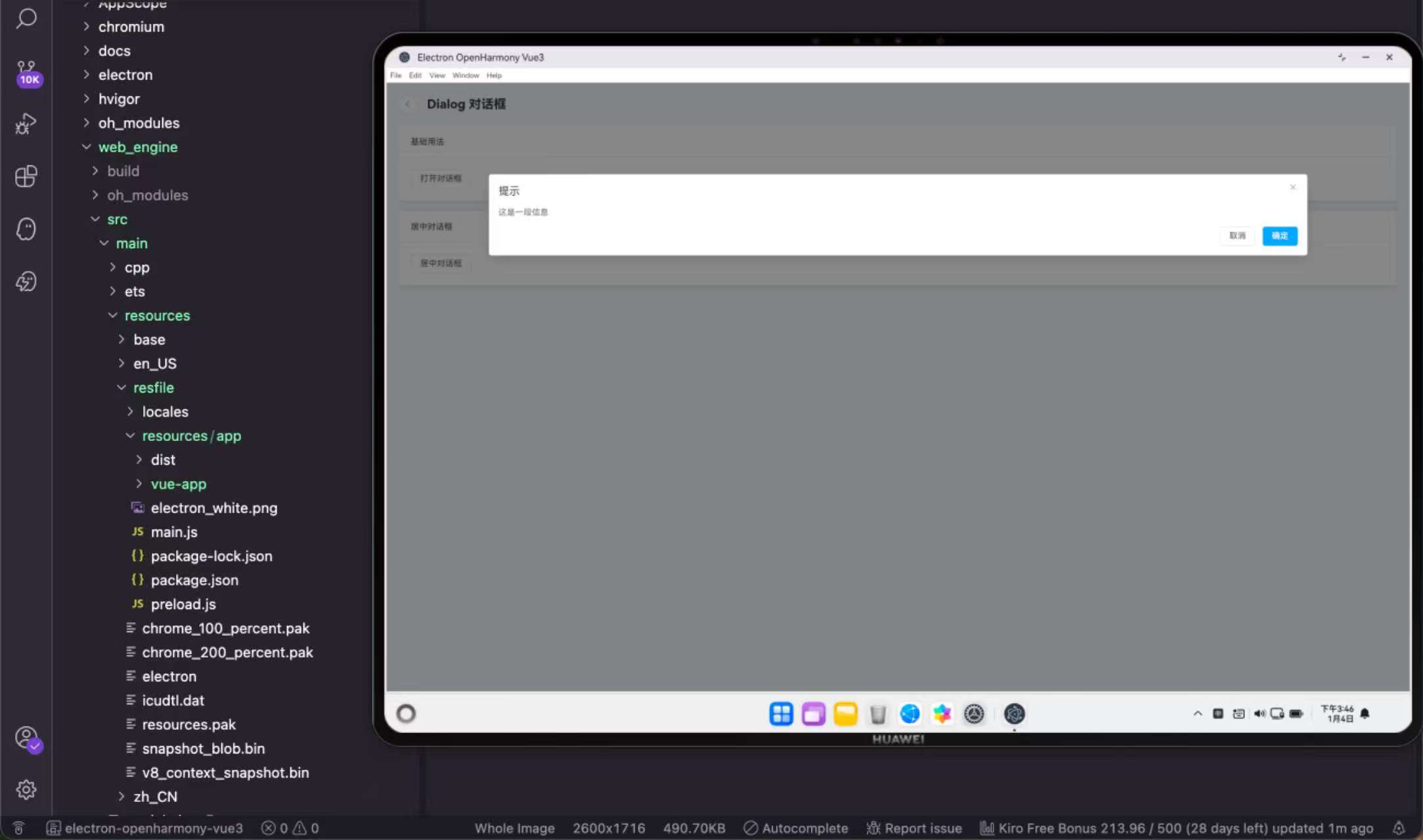
Electron for OpenHarmony 实战:Dialog 对话框组件实现
对话框是一种模态窗口,用于在不离开当前页面的情况下与用户进行交互。确认删除、编辑信息、查看详情这些场景都会用到对话框。这篇文章来聊聊在 Electron for OpenHarmony 项目中如何实现 Dialog 对话框组件。
对话框的使用场景
对话框主要用于以下几种场景:
需要用户确认的操作,比如删除数据前的二次确认;需要用户填写少量信息,比如修改密码、添加备注;展示详细信息,比如查看订单详情;以及一些需要用户专注处理的任务,比如文件上传进度。
相比跳转到新页面,对话框的优势是保持了上下文,用户处理完对话框里的事情后可以继续之前的操作。
控制对话框显示
对话框的显示隐藏通过 v-model 绑定一个布尔值来控制:
<script setup lang="ts">
import { ref } from 'vue'
import { useRouter } from 'vue-router'
const router = useRouter()
const dialogVisible = ref(false)
const centerDialogVisible = ref(false)
</script>
dialogVisible 初始值是 false,对话框默认隐藏。点击按钮把它设为 true,对话框就显示出来了。关闭对话框时再设回 false。
这种声明式的控制方式比命令式的 dialog.open() 更符合 Vue 的设计理念,状态变化会自动反映到视图上。
基础对话框
一个基础的对话框包含标题、内容和底部按钮:
<el-card class="demo-card">
  <template #header>基础用法</template>
  <el-button @click="dialogVisible = true">打开对话框</el-button>
  <el-dialog v-model="dialogVisible" title="提示" width="80%">
    <span>这是一段信息</span>
    <template #footer>
      <el-button @click="dialogVisible = false">取消</el-button>
      <el-button type="primary" @click="dialogVisible = false">确定</el-button>
    </template>
  </el-dialog>
</el-card>
v-model 绑定显示状态,title 设置标题,width 设置宽度。对话框的内容直接写在标签内部,底部按钮通过 #footer 插槽定义。
width="80%" 用百分比设置宽度,这样在不同屏幕尺寸下都能有合适的显示效果。也可以用固定像素值,比如 width="500px"。
点击取消或确定按钮都会把 dialogVisible 设为 false,对话框关闭。实际项目中确定按钮通常还会执行一些业务逻辑,比如提交表单、调用接口。
居中对话框
有时候需要标题和底部按钮都居中显示:
<el-card class="demo-card">
  <template #header>居中对话框</template>
  <el-button @click="centerDialogVisible = true">居中对话框</el-button>
  <el-dialog v-model="centerDialogVisible" title="警告" width="80%" center>
    <span>确定要执行此操作吗?</span>
    <template #footer>
      <el-button @click="centerDialogVisible = false">取消</el-button>
      <el-button type="primary" @click="centerDialogVisible = false">确定</el-button>
    </template>
  </el-dialog>
</el-card>
center 属性让标题和底部按钮居中对齐,内容区域不受影响。这种样式适合简短的确认提示,看起来更正式一些。
对话框内嵌表单
对话框里放表单是很常见的需求,比如编辑用户信息:
<script setup lang="ts">
import { ref, reactive } from 'vue'
import { ElMessage } from 'element-plus'
import type { FormInstance } from 'element-plus'

const dialogVisible = ref(false)
const formRef = ref<FormInstance>()
const form = reactive({
  name: '',
  email: '',
  phone: ''
})

const rules = {
  name: [{ required: true, message: '请输入姓名', trigger: 'blur' }],
  email: [{ required: true, message: '请输入邮箱', trigger: 'blur' }]
}

const openDialog = () => {
  dialogVisible.value = true
}

const handleClose = () => {
  formRef.value?.resetFields()
  dialogVisible.value = false
}

const handleSubmit = async () => {
  if (!formRef.value) return
  await formRef.value.validate((valid) => {
    if (valid) {
      ElMessage.success('保存成功')
      handleClose()
    }
  })
}
</script>

<template>
  <el-button type="primary" @click="openDialog">编辑用户</el-button>
  <el-dialog v-model="dialogVisible" title="编辑用户信息" width="500px" @close="handleClose">
    <el-form ref="formRef" :model="form" :rules="rules" label-width="80px">
      <el-form-item label="姓名" prop="name">
        <el-input v-model="form.name" />
      </el-form-item>
      <el-form-item label="邮箱" prop="email">
        <el-input v-model="form.email" />
      </el-form-item>
      <el-form-item label="电话" prop="phone">
        <el-input v-model="form.phone" />
      </el-form-item>
    </el-form>
    <template #footer>
      <el-button @click="handleClose">取消</el-button>
      <el-button type="primary" @click="handleSubmit">保存</el-button>
    </template>
  </el-dialog>
</template>
对话框关闭时通过 @close 事件重置表单,避免下次打开时还显示上次的数据。resetFields 方法会把表单重置到初始状态,同时清除校验状态。
提交前先调用 validate 方法校验表单,校验通过才执行保存逻辑。这样可以保证用户输入的数据是有效的。
关闭前确认
有时候用户在对话框里做了修改,点击关闭时需要提醒他保存:
<script setup lang="ts">
import { ref } from 'vue'
import { ElMessageBox } from 'element-plus'

const dialogVisible = ref(false)
const hasChanged = ref(false)

const handleBeforeClose = (done: () => void) => {
  if (hasChanged.value) {
    ElMessageBox.confirm('内容已修改,确定要关闭吗?', '提示', {
      confirmButtonText: '确定',
      cancelButtonText: '取消',
      type: 'warning'
    }).then(() => {
      hasChanged.value = false
      done()
    }).catch(() => {
      // 用户点击取消,不关闭对话框
    })
  } else {
    done()
  }
}
</script>

<template>
  <el-dialog v-model="dialogVisible" title="编辑" :before-close="handleBeforeClose">
    <el-input @input="hasChanged = true" placeholder="输入内容后关闭会提示" />
  </el-dialog>
</template>
:before-close 属性接收一个函数,在对话框关闭前调用。函数参数 done 是一个回调,调用它才会真正关闭对话框。这样就可以在关闭前做一些判断或确认。
ElMessageBox.confirm 是 Element Plus 提供的确认框,返回 Promise,用户点击确定 resolve,点击取消 reject。
禁止点击遮罩关闭
默认情况下点击对话框外面的遮罩层会关闭对话框,有些场景需要禁止这个行为:
<el-dialog
  v-model="dialogVisible"
  title="重要操作"
  :close-on-click-modal="false"
  :close-on-press-escape="false"
>
  <span>请完成操作后点击按钮关闭</span>
</el-dialog>
:close-on-click-modal="false" 禁止点击遮罩关闭,:close-on-press-escape="false" 禁止按 ESC 键关闭。这样用户只能通过点击按钮来关闭对话框,适合一些必须完成的操作流程。
自定义头部
默认的头部只有标题和关闭按钮,可以通过插槽自定义:
<el-dialog v-model="dialogVisible" width="500px">
  <template #header="{ close, titleId, titleClass }">
    <div style="display: flex; justify-content: space-between; align-items: center;">
      <span :id="titleId" :class="titleClass" style="font-weight: bold;">自定义标题</span>
      <div>
        <el-button size="small" @click="handleHelp">帮助</el-button>
        <el-button size="small" type="danger" @click="close">关闭</el-button>
      </div>
    </div>
  </template>
  <span>对话框内容</span>
</el-dialog>
#header 插槽可以完全自定义头部内容,插槽参数里的 close 是关闭函数,titleId 和 titleClass 用于无障碍访问。
嵌套对话框
有时候需要在对话框里再打开一个对话框:
<script setup lang="ts">
import { ref } from 'vue'

const outerVisible = ref(false)
const innerVisible = ref(false)
</script>

<template>
  <el-button @click="outerVisible = true">打开外层对话框</el-button>

  <el-dialog v-model="outerVisible" title="外层对话框" width="600px">
    <span>这是外层对话框的内容</span>
    <el-button @click="innerVisible = true" style="margin-top: 16px;">打开内层对话框</el-button>

    <el-dialog v-model="innerVisible" title="内层对话框" width="400px" append-to-body>
      <span>这是内层对话框的内容</span>
      <template #footer>
        <el-button @click="innerVisible = false">关闭</el-button>
      </template>
    </el-dialog>

    <template #footer>
      <el-button @click="outerVisible = false">关闭</el-button>
    </template>
  </el-dialog>
</template>
嵌套对话框需要给内层对话框加上 append-to-body 属性,让它挂载到 body 下而不是外层对话框内部,这样层级关系才正确,遮罩层也能正常显示。
与鸿蒙原生能力结合
在 Electron for OpenHarmony 项目中,对话框可以和原生能力配合使用:
<script setup lang="ts">
import { ref } from 'vue'
import { useOhos } from '@/composables/useOhos'
import { ElMessage } from 'element-plus'

const { showNotification, openFile } = useOhos()
const dialogVisible = ref(false)
const selectedFile = ref('')

const handleSelectFile = async () => {
  const files = await openFile({
    title: '选择文件',
    filters: [{ name: '图片', extensions: ['png', 'jpg', 'jpeg'] }]
  })
  if (files && files.length > 0) {
    selectedFile.value = files[0]
  }
}

const handleConfirm = async () => {
  if (!selectedFile.value) {
    ElMessage.warning('请先选择文件')
    return
  }
  await showNotification('上传成功', `文件: ${selectedFile.value}`)
  dialogVisible.value = false
  selectedFile.value = ''
}
</script>

<template>
  <el-button type="primary" @click="dialogVisible = true">上传文件</el-button>

  <el-dialog v-model="dialogVisible" title="上传文件" width="400px">
    <div style="text-align: center; padding: 20px 0;">
      <el-button @click="handleSelectFile">选择文件</el-button>
      <p v-if="selectedFile" style="margin-top: 16px; color: #409eff;">
        已选择: {{ selectedFile }}
      </p>
    </div>
    <template #footer>
      <el-button @click="dialogVisible = false">取消</el-button>
      <el-button type="primary" @click="handleConfirm">确认上传</el-button>
    </template>
  </el-dialog>
</template>
这个例子展示了文件上传场景:点击选择文件按钮调用原生文件选择器,选择后显示文件路径,确认上传后发送系统通知。对话框提供了一个聚焦的操作环境,让用户专注于文件选择和上传这个任务。
全屏对话框
内容很多时可以让对话框全屏显示:
<script setup lang="ts">
import { ref } from 'vue'

const dialogVisible = ref(false)
const fullscreen = ref(false)

const toggleFullscreen = () => {
  fullscreen.value = !fullscreen.value
}
</script>

<template>
  <el-button @click="dialogVisible = true">打开对话框</el-button>

  <el-dialog v-model="dialogVisible" title="详情" :fullscreen="fullscreen" width="80%">
    <template #header="{ close }">
      <div style="display: flex; justify-content: space-between; align-items: center; width: 100%;">
        <span style="font-size: 18px;">详情</span>
        <div>
          <el-button size="small" @click="toggleFullscreen">
            {{ fullscreen ? '退出全屏' : '全屏' }}
          </el-button>
          <el-button size="small" @click="close">关闭</el-button>
        </div>
      </div>
    </template>
    <div style="height: 300px;">
      这里是详情内容,全屏模式下可以显示更多信息...
    </div>
  </el-dialog>
</template>
:fullscreen 属性控制是否全屏,可以动态切换。全屏模式下对话框会占满整个视口,适合展示大量内容或者需要沉浸式操作的场景。
对话框动画
Element Plus 的对话框默认有淡入淡出动画,可以自定义:
/* 自定义对话框动画 */
.custom-dialog {
  --el-dialog-margin-top: 10vh;
}

.custom-dialog .el-dialog {
  animation: dialog-fade-in 0.3s ease;
}

@keyframes dialog-fade-in {
  from {
    opacity: 0;
    transform: translateY(-20px);
  }
  to {
    opacity: 1;
    transform: translateY(0);
  }
}
通过 CSS 变量和动画可以调整对话框的位置和出现效果,让交互更有层次感。
小结
Dialog 对话框是模态交互的核心组件,这篇文章介绍了它的各种用法:基础对话框、居中样式、内嵌表单、关闭前确认、禁止遮罩关闭、自定义头部、嵌套对话框,以及与鸿蒙原生能力的结合。对话框的核心是通过 v-model 控制显示隐藏,通过插槽自定义内容。合理使用对话框可以让用户在不离开当前页面的情况下完成各种操作,提升使用体验。
欢迎加入开源鸿蒙PC社区:https://harmonypc.csdn.net/
赋能鸿蒙PC开发者,共建全场景原生生态,共享一次开发多端部署创新价值。
更多推荐
 24
24 0
0- 0


 已为社区贡献1条内容

所有评论(0)